Graphic Design Portfolio Christchurch | Real Design Projects, Before & After Results & Client Success Stories

XDC Manifesto /0{{total_slide_count}} Creativity with Purpose Join us.
Let’s make your brand unstoppable
Contact XDC . 0{{current_slide_index}} Every pixel, every word, every strategy is crafted with intention — to connect, inspire, and convert. You want more business ~ Right?!
XDC Manifesto /0{{total_slide_count}} Creativity with Purpose Work Hard //
Brand Harder
More on BRANDfix . 0{{current_slide_index}} Every pixel, every word, every strategy is crafted with intention — to connect, inspire, and convert.
Your customised fixes /0{{total_slide_count}} Maximum Impact—all Brand Fixes—all at once… Maximum Impact MI Marketing Package… . 0{{current_slide_index}} Get 7 Powerful "MI" Marketing Package Benefits to Fuel Unstoppable Business Growth (All‑in‑One Powerhouse!). Why juggle 6 creative and technical vendors when you can have just 1 partner for EVERYTHING? LOGOS clint@xdc.nz Get in Touch 021 11 44 014 Click the BRAND PILLAR to switch between places About XDC.NZ CLICK 2 READ MORE BELOW WEB SEO GFX SOCIALS BRAND PILLARS X-FACTOR //
BRANDfix logo – XDC’s Business Brand Warrant of Fitness and audit service | Branding Repairs & Training in Canterbury | XDC.NZ XDC.nz Manifesto clip showcasing the mission and impact of all Brand Pillars: BRANDfix, LOGOfix, WEBSITEfix, SEOfix, GRAPHfix, SIGNAGEfix, BUZZfix, GOOGLEfix, CRE8Vfix, and miPACKAGE miPACKAGE logo – XDC’s full brand ecosystem integration service BP7-Full-Ecosystem-Brand-Growth-Engine-MI-Maximum-Impact-Package-Business-Consulting-Christchurch-Rolleston_187.jpeg XDC.NZ — Christchurch Logo, Graphic & Web Designer

Graphic Design Portfolio Christchurch | Real Design Projects, Before & After Results & Client Success Stories

These aren’t stock examples, hypothetical concepts or AI-generated images — they’re real client projects, showing what changed, what XDC.NZ did and what the finished result achieved.

Graphic designer  web designer trusted for 25 years in design branding websites and marketing logo

Real Graphic Design Projects

Real projects. Real businesses. Real design problems.

From brochures and marketing material to signage, branding, promotional campaigns and digital design, these projects show how XDC.NZ turns rough, outdated or ineffective material into professional communication that businesses can actually use.

NAI Harcourts — Michael Gawith: Print & Marketing Material

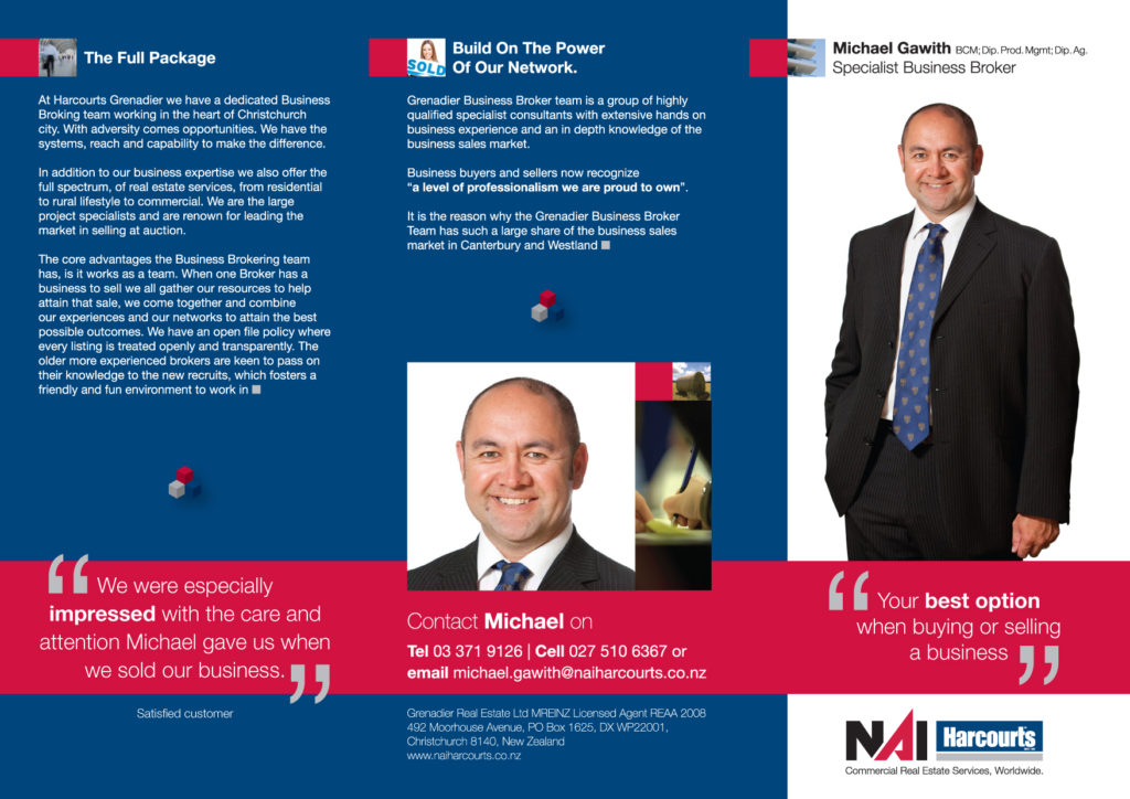
Tri-Fold Business Broker Brochure | Christchurch

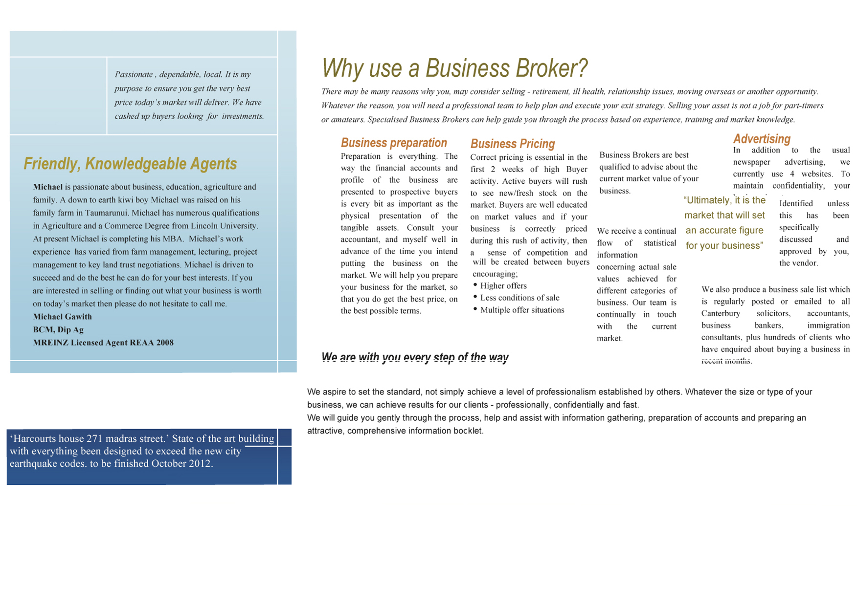
Nai harcourts michael gawith business broker brochure  before front

Tri-Fold Brochure Cover: BEFORE

Client-supplied Microsoft Word brochure

Nai harcourts michael gawith business broker brochure  after front

Tri-Fold Brochure Cover: AFTER

Professional tri-fold brochure

Nai harcourts michael gawith business broker brochure  before back

Tri-Fold Brochure Inside: BEFORE

Client-supplied Microsoft Word brochure

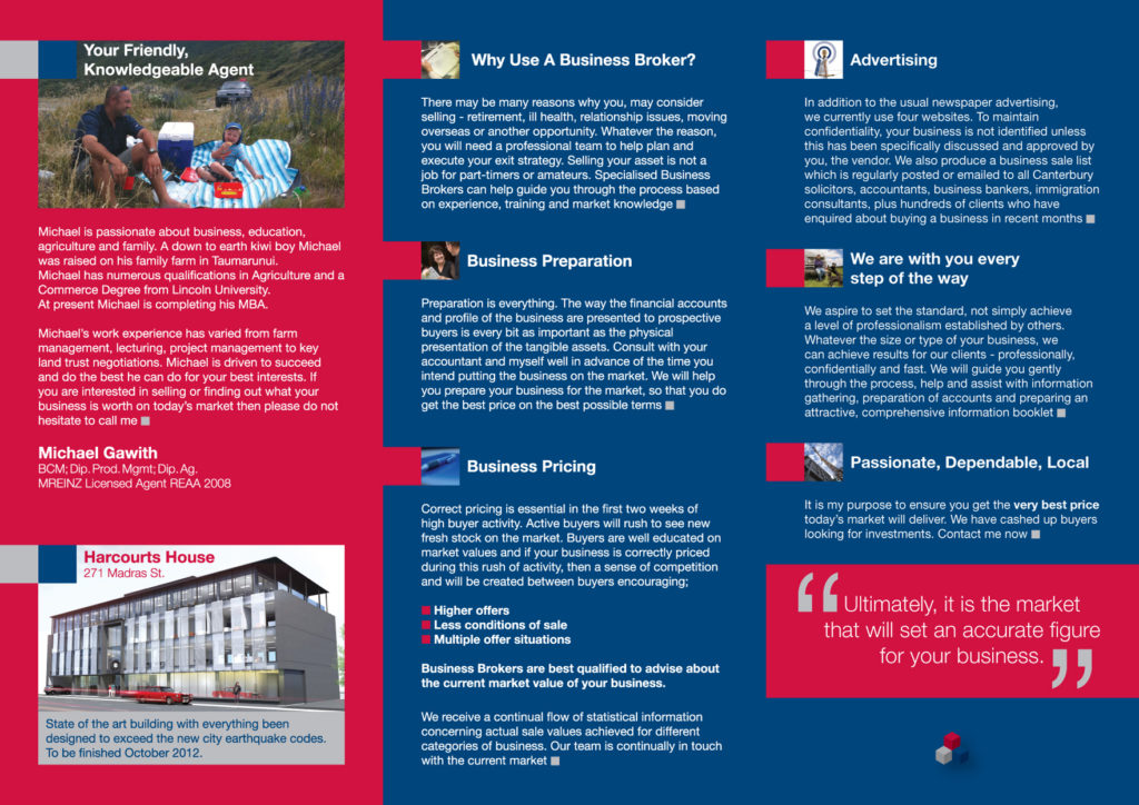
Nai harcourts michael gawith business broker brochure  after back

Tri-Fold Brochure Inside: AFTER

Professional tri-fold brochure

THE DESIGN CHALLENGE

Michael needed to up his game and hang with the big boys.

The original brochure was heavily text-based and lacked the visual hierarchy, personality and professional finish needed to establish immediate trust with prospective business sellers and buyers.

The challenge wasn’t simply to make the brochure prettier. It was to make Michael and his expertise feel credible, approachable and worth trusting.


THE GRAPHIC DESIGN FIX

The supplied content was reorganised around a clear information hierarchy, with the design doing more of the communication work.

The redesign introduced:

  • Harcourts corporate colours with strong navy backgrounds and energetic red panels
  • Clear typographic hierarchy to break up substantial information
  • Supporting mini-images to make the content more people-focused
  • Photography of Michael and his family to establish personality and trust
  • Stronger presentation of his qualifications and professional experience
  • Structured sections explaining business preparation, pricing, advertising and the selling process
  • Prominent contact information and location details
  • A stronger overall corporate presence without losing Michael’s approachable personality

The result was a brochure that felt like it belonged in the same room as the established players in the Christchurch business-broking market.


BUILD ON THE POWER OF OUR NETWORK

The brochure also incorporated the wider Grenadier Business Broker Team proposition, positioning Michael within an established professional network rather than presenting him as a standalone operator.

That helped reinforce the message that clients weren’t simply getting an individual agent — they were gaining access to a broader network, specialist knowledge and experience in the business sales market.


MAKING MICHAEL THE BRAND

One of the most important design decisions was making Michael himself part of the communication.

His original copy talked about his background, family, agriculture, education and business experience.

Rather than leaving those qualities buried in paragraphs, the design brought the person forward.

The positioning became:

Your Friendly, Knowledgeable Agent

Professional enough to compete with the big players.

Personal enough to trust.


CLIENT TESTIMONIAL

“XDC took what we had and completely transformed how we presented ourselves. The original brochure was basic and simply wasn’t doing the job. Clint understood that we needed to look professional, credible and approachable, and the finished brochure gave us a much stronger presence with prospective clients. The response was fantastic, and the work generated far more interest than we had been getting before.”

Michael Gawith — Business Broker, NAI Harcourts / Grenadier Business Brokers, Christchurch


THE RESULT

The brochure gave Michael a dramatically stronger sales tool — one that better reflected his experience, personality, and professional standing.

And the commercial outcome was even better:

More clients. More business. More work than Michael knew what to do with.

The brochure wasn’t simply a redesign.

It helped Michael present himself at the level his business deserved — and gave prospective clients a reason to trust him before the first conversation.


BRAND PILLARS

LOGOfix — Logo design and brand identity
GRAPHfix — Supporting visual assets and brand applications
WEBSITEfix — Digital assets aligned with the developing WordPress website

PROJECT SNAPSHOT

Client: Michael Gawith, NAI Harcourts / Grenadier Business Brokers
Project: Tri-Fold Business Broker Brochure
Location: Christchurch
Starting point: Microsoft Word document
Design: XDC.NZ
Focus: Trust • Professionalism • Personality • Business Sales
Positioning: Your Friendly, Knowledgeable Agent
Brand Pillars: GRAPHfixLOGOfixWEBSITEfix

Stack Electrical — Presentation Folder & Capability Statements

Nationwide Electrical Firm | Christchurch-Based

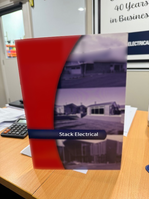
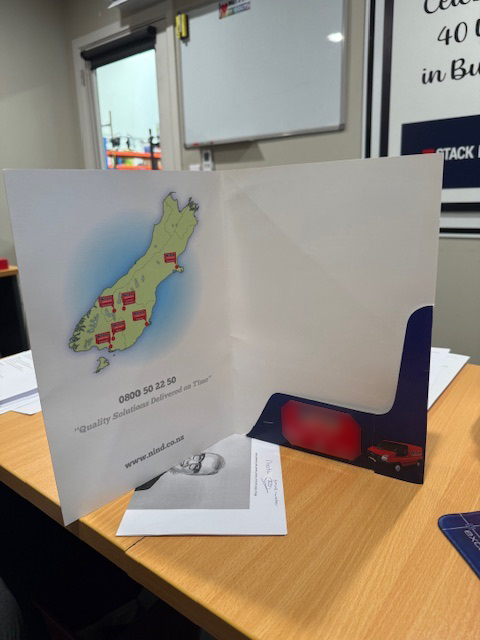
Stack electrical presentation folder  before outside cover

Supplied Presentation Folder — Outside Cover: BEFORE

Client-supplied photo of the old presentation folder

Stack electrical presentation folder  before inside cover

Supplied Presentation Folder — Inside Cover: BEFORE

Client-supplied photo of the old presentation folder

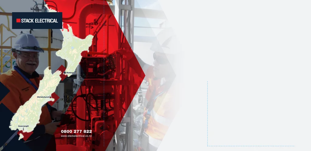
Stack electrical presentation folder  after inside cover artwork

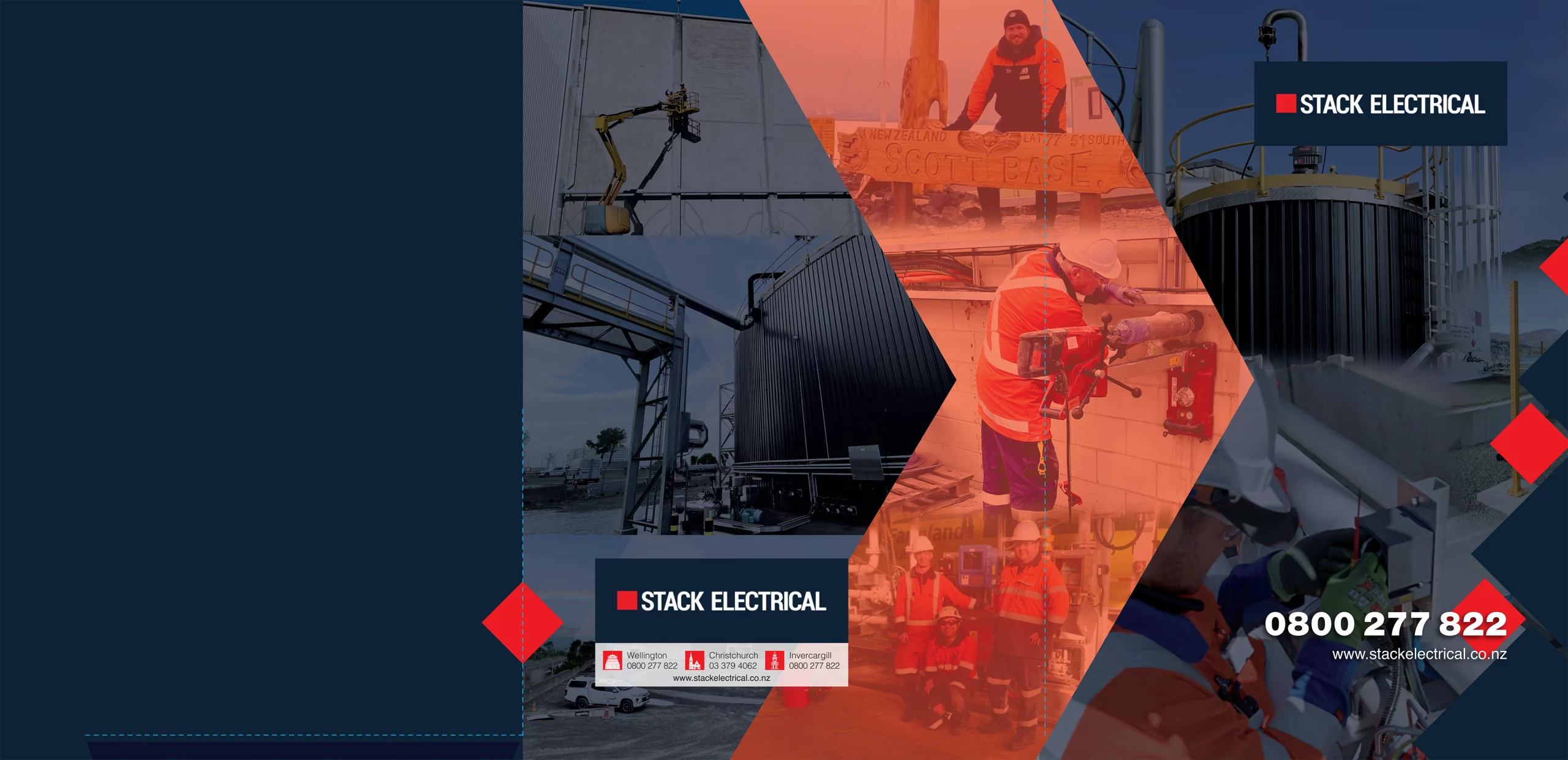
Complete Flat Outside Cover Artwork: AFTER

XDC design of the new presentation folder (unfolded)

Stack electrical presentation folder  after outside cover artwork

Complete Flat Inside Cover Artwork: AFTER

XDC design of the new presentation folder (unfolded)

FROM A FORGOTTEN PRESENTATION FOLDER TO A TENDER-WINNING TOOLKIT

Stack Electrical came to XDC.NZ with a simple problem: their existing presentation folder wasn’t doing them any favours.

It was basic, flat and visually unremarkable — and, more importantly, it wasn’t helping them win quotes and tenders.

The folder had become something they simply weren’t using. Eventually, they let their existing supply run out.


THE FIX

Rather than designing another isolated piece of print, XDC.NZ used Stack Electrical’s new website as the visual foundation and worked from the direction supplied by the company’s director.

The result was a much stronger presentation folder with a consolidated visual style, stronger hierarchy and a more professional feel.

The design was presented as a 3D visualisation so Stack Electrical could see exactly what their finished folder would look like before committing to production.

They loved it.

XDC.NZ then arranged local Christchurch printing at a highly competitive price, taking the project from concept through to finished print.

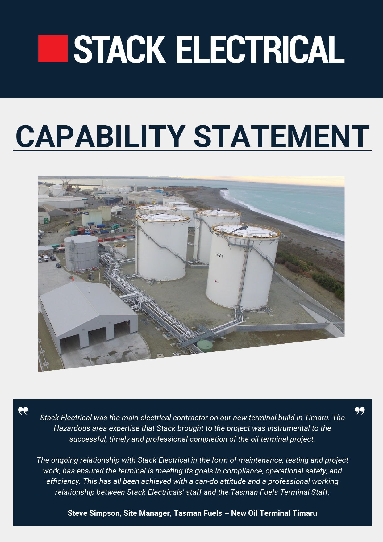
Stack electrical generic capability statement  before

Supplied Document — Cover: BEFORE

Client-supplied Word Document of the old Capability Statement Document

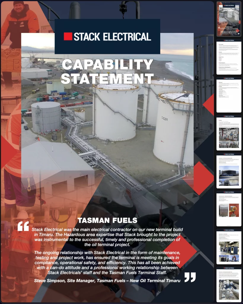
Stack electrical generic capability statement  after

Designed Document Set — Cover: AFTER

XDC Graphic Design for the complete document as a template for the new Capability Statement Document

THEN IT GREW

The folder became the starting point for a much larger tender-support system.

Six Capability Statements were subsequently designed and laid out:

  • Bitumen
  • Breweries & Distilleries
  • Commercial
  • Generic
  • Hydrogen & Biogas
  • Industrial

The result was a consistent suite of professional tender documents that made it significantly easier for Stack Electrical to present its capabilities to prospective clients.

The design created a consolidated look across the business rather than having every document feeling like a separate piece of communication.


A LITTLE EXTRA XDC

The project also included promotional material supporting Stack Electrical’s school sponsorship and community involvement.

Where appropriate, XDC.NZ incorporated these messages into the collateral without compromising the professional presentation.


CLIENT TESTIMONIAL

“XDC completely changed the way we presented Stack Electrical. Our old presentation folder was basic, dated and wasn’t something we were particularly keen to use. Clint took our existing brand and website direction and turned it into a professional, modern presentation that actually represented the quality of our work. The project also grew into our suite of Capability Statements, which made putting together tenders and submissions much easier. We were really impressed with the result and the way Clint brought everything together.”

Stack Electrical — Christchurch


THE RESULT

A presentation folder that had effectively become redundant was transformed into a professional sales and tender tool — and then expanded into a complete suite of Capability Statements.

One folder became an entire tender communication system.


BRAND PILLARS

GRAPHfix — Presentation folder and Capability Statement design
BRANDfix — Consistent visual presentation of the Stack Electrical brand
CRE8Vfix — Creative direction, visual hierarchy and presentation thinking

PROJECT SNAPSHOT

Client: Stack Electrical
Project: Presentation Folder + Capability Statements
Location: Christchurch
Starting point: Basic, flat and underused existing presentation folder
Design: XDC.NZ
Focus: Tenders • Professionalism • Capability • Consistency • Business Development
Positioning: Professional presentation that helps Stack Electrical compete for the work it is capable of delivering
Brand Pillars: GRAPHfixBRANDfixCRE8Vfix

NeuroShiftology — Brand Identity & Brand Refresh

Logo Design | Dunedin

Neuroshiftology logo  final stacked version

NeuroShiftology final logo Icon designed by XDC.NZ

Part of a family of logos created as standard when doing a logo with XDC

Neuroshiftology logo  final icon

NeuroShiftology final Stacked Logo designed by XDC.NZ

Part of a family of logos created as standard when doing a logo with XDC

BEFORE

NeuroShiftology started with an ambitious concept — and a very simple visual starting point.

XDC.NZ was supplied with a sketch consisting of a word treatment and a stick-figure idea.

The challenge was to take that starting point and translate the thinking behind NeuroShiftology into a visual identity that could work professionally across digital and print applications.


THE CHALLENGE

NeuroShiftology is a somatic and subconscious nervous-system reprogramming method created by health practitioner Kirsten Manchester.

Rather than trying to visually explain the entire methodology in a single mark, XDC.NZ focused on creating an identity that could provide a recognisable visual foundation for the developing business.

The goal was to move the brand beyond its early backyard-business origins and create something capable of supporting much bigger ambitions.


THE FIX

XDC.NZ developed the original sketch into a polished logo and visual identity.

Following several rounds of refinement and tweaks, the identity was aligned with the visual direction already being developed for the WordPress website.

Rather than delivering only one logo file, XDC.NZ created a practical logo family for different applications.


THE BRAND SYSTEM

The finished identity included:

  • Primary stacked logo
  • Horizontal logo
  • Reversed version
  • Greyscale version
  • Icon-only version
  • Email signature
  • Supporting website assets

This gives NeuroShiftology flexibility across websites, email, social media, documents and future marketing material while retaining a consistent visual identity.


WORKING AS PART OF A TEAM

The project also demonstrates how XDC.NZ can operate as an outsourced specialist within a wider creative or development team.

With the website being developed separately, XDC.NZ provided the logo design and visual assets required to ensure the brand could carry consistently into the digital environment.


CLIENT TESTIMONIAL

“Clint at XDC.NZ was AMAZING. I’m a startup owner and not very tech-savvy, and Clint made the whole logo process incredibly easy. Even though I’m not based in Christchurch, he gave me fantastic advice and guidance as if we were working face-to-face. Fast turnaround, great colour options, and all logo files supplied without me having to ask. If you’re a startup or tech-challenged, Clint is the person to go to. I can see why he’s so highly recommended in Rolleston and Christchurch!”

Kirsten, NeuroShiftology, Dunedin


THE RESULT

A rough initial sketch became a complete, adaptable identity system ready to support the next stage of NeuroShiftology’s development.

From a sketch and an idea to a brand built to go much further.


BRAND PILLARS

LOGOfix — Logo design and brand identity
GRAPHfix — Supporting visual assets and brand applications
WEBSITEfix — Digital assets aligned with the developing WordPress website

PROJECT SNAPSHOT

Client: Kirsten Manchester / NeuroShiftology
Project: Logo Design + Brand Identity System + Website Assets
Location: Dunedin / New Zealand
Starting point: Rough logo sketch and stick-figure concept
Design: XDC.NZ
Focus: Brand Identity • Visual Translation • Consistency • Digital Assets
Positioning: Turning an abstract and developing concept into a professional, adaptable visual identity
Brand Pillars: LOGOfixGRAPHfixWEBSITEfix

Spinal Flow Healing — Small Business Transformation

Graphic Design for Small Business | Christchurch

Spinal flow healing  final logo

The Spinal Flow Healing logo is designed by XDC.NZ Christchurch

Highly technical medical logo

Spinal flow healing  a4 poster

Spinal Flow Healing Poster is designed by XDC.NZ Christchurch

Highly technical medical poster and branding

BEFORE

Julie is a specialist practitioner with a strong desire to use her experience to help others experiencing pain.

But the business didn’t initially have a visual presence that reflected the ambition, professionalism or individuality behind it.

Like many very small businesses, much of the communication had evolved around what was available — Word documents, basic marketing material and a business that was still operating on a very small scale.

The challenge was to make the business look and feel considerably more established without losing the personal nature that made it Julie’s business.


THE BRAND FIX

XDC.NZ started with the logo.

The brief required something powerful and contemporary that could communicate trust, professionalism and a high-tech feel.

Blue was deliberately used as a key part of the identity, helping establish a more clinical, technological and trustworthy visual language.

The new logo then became the foundation for everything else.


THE WEBSITE

With the identity established, XDC.NZ created a new Wix website to give Spinal Flow Healing a professional home online.

The website provided somewhere to explain the business, communicate the offering and present Julie professionally to people discovering her for the first time.


THE GRAPHIC DESIGN SYSTEM

The new identity was then carried into a range of practical marketing material, including:

  • Flyers
  • Rack cards
  • Business cards
  • Posters
  • Pull-up banners
  • Expo and trade-show material
  • Supporting promotional graphics

Rather than designing each piece independently, the material was developed as a connected visual system.


SOCIAL MEDIA & CREATIVE SUPPORT

XDC.NZ also developed branded social graphics and supporting digital content.

Julie wanted to learn how to manage her own social posting, so rather than taking everything away from her, XDC.NZ helped establish the visual side while allowing her to develop her own confidence with the platform.

This is where the project moved beyond graphic design alone.


CRE8Vfix — THE BIGGER PICTURE

Throughout the project, XDC.NZ provided creative thinking and practical business advice around how the brand could present itself, communicate more effectively and make the most of the material being created.

The work was designed to make the business easier to market — not simply prettier.

XDC.NZ also made the project more manageable financially by allowing Julie to pay progressively rather than having the entire transformation become an immediate financial burden.


STILL GROWING

The transformation is ongoing.

New business cards are now being prepared with small refinements to the design, ready for local Christchurch printing.

The identity has created a foundation that can continue to evolve as the business grows.


CLIENT RESULT STATEMENT

From a small Southbridge garage-based business to a professional brand built to punch well above its weight. XDC.NZ transformed Spinal Flow Healing from a basic, low-profile presentation into a complete visual and digital brand — starting with a powerful new logo and extending across the website, print, posters, pull-up banners, business cards, social graphics and ongoing business support. The result was a cohesive, professional presence that gave Julie the confidence and tools to take her business to the next level.”

Julie, Spinal Flow with Julie, Southbridge, Chrstchurch


THE RESULT

Spinal Flow Healing moved from basic documents and small-business “make do” marketing to a coordinated professional identity, website and marketing system.

The business remains personal and independent — but its visual presence now gives it the opportunity to punch considerably above its weight.

From a small Southbridge garage business to a professional brand with a much bigger presence.


BRAND PILLARS

LOGOfix — New visual identity and logo
WEBSITEfix — Wix website design
GRAPHfix — Print, promotional and exhibition material
BUZZfix — Branded social media graphics
CRE8Vfix — Creative direction and practical business support

PROJECT SNAPSHOT

Client: Julie / Spinal Flow Healing
Project: Complete Small Business Brand & Marketing Transformation
Location: Southbridge, Canterbury
Starting point: Small home/garage-based business with basic Word documents and limited marketing material
Design: XDC.NZ
Focus: Professionalism • Trust • Brand Development • Website • Print • Marketing • Business Support
Positioning: Helping a small business punch well above its weight
Brand Pillars: LOGOfixWEBSITEfixGRAPHfixBUZZfixCRE8Vfix

Panther Property Services — Signage & Complete Local Business Transformation

Signage & Environmental Graphics | Christchurch

Panther property services  logo log  icon

Panther Property Services Logo & Icon created by XDC.NZ for a Selwyn property services business

Part of a family of vector logos used for signage, print, and digital applications

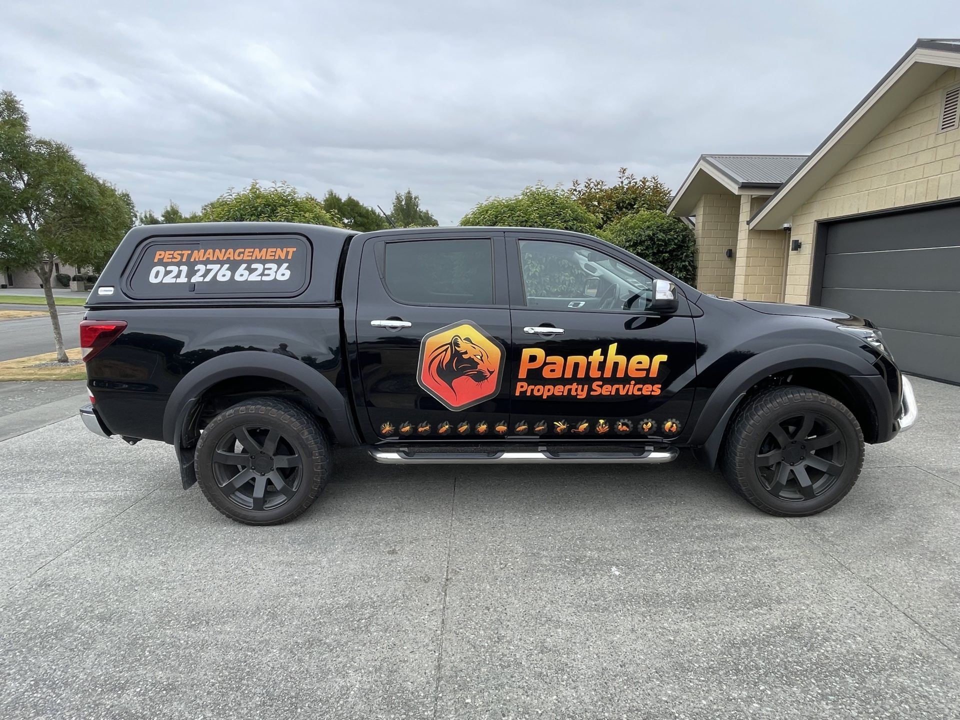
Panther property services  ute signage

Panther Property Services Ute Signage

Professional computer-cut vinyl lettering and printed images on vinyl UV-Protected signage

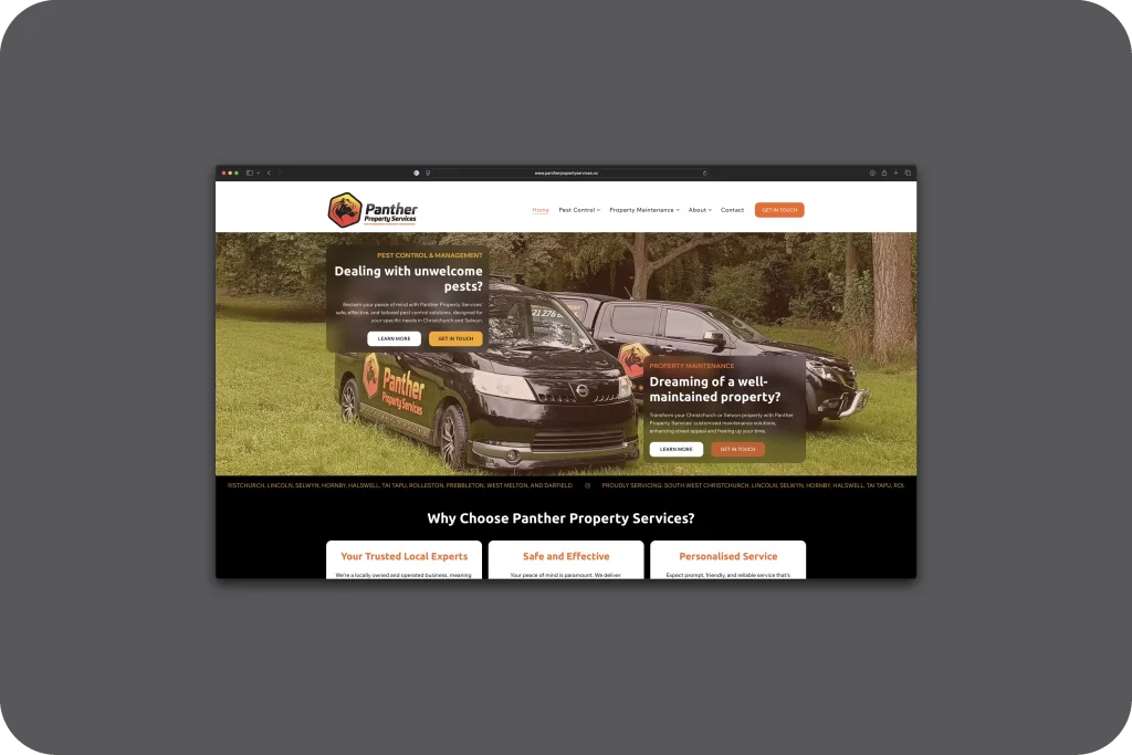
Panther property services  wix website

Graphic Design & Print (Visual Communication with Strategy)

The project helped establish a strong local presence for the Selwyn and Christchurch property services business

Panther property services  wix website

Panther Property Services — Full miPACKAGE Branding, Website & SEO

This professional Wix Website Design formed part of the wider local marketing and SEO strategy for the property services and pest management business serving Selwyn and Christchurch

BEFORE

Panther Property Services already had an established business in Nelson, but the move to Christchurch created a new challenge.

The business needed to establish itself in a completely different local market.

It wasn’t enough simply to put the existing business name on a vehicle and hope people noticed.

XDC.NZ approached the project as a complete local-business transformation — from the brand people would recognise on the road through to the Google presence and website people would find when they searched.


THE BRAND

The first step was a new Panther identity.

XDC.NZ created a large, stylised panther head contained within a distinctive sheared hexagon, giving the business a strong visual mark that could work particularly well at vehicle scale.

The identity was designed to be recognisable from a distance and memorable when seen repeatedly around the local area.


THE DIGITAL FIX

The existing Google Business Profile was taken over and developed into a stronger local visibility asset.

XDC.NZ also created a new Wix website and worked across the SEO and local-search ecosystem to establish Panther Property Services in Christchurch and Selwyn.

The aim was simple:

Make Panther visible where local customers were looking — and recognisable when they saw the business out and about.


THE BIG FIX — SIGNAGE

This is where the transformation really became visible.

Rather than immediately committing to expensive full vehicle wraps, XDC.NZ designed strong computer-cut signage for the black ute and van.

Bright orange became the standout colour against the dark vehicles.

The Panther logo was made deliberately large.

The mobile number was prominent.

And along the lower sections of the vehicles, XDC.NZ created a collection of illustrated pests and bugs.

That detail was important.

People don’t necessarily stop to read vehicle advertising.

But they look.

The bugs gave them something to notice, understand and remember.

The vehicles became moving billboards throughout Christchurch and Selwyn.


LOCAL MARKETING

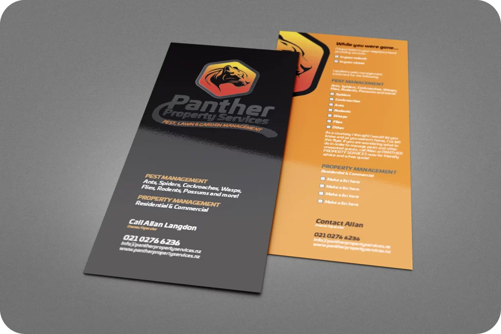
The vehicle signage was supported with rack cards and flyers for targeted letterbox drops.

The campaign used a deliberately local message — including the cheeky idea of telling people that Panther had “been next door” servicing a nearby property.

That created a little FOMO:

If your neighbour has had their property treated, perhaps yours needs checking too.

The combination of vehicle visibility, printed marketing, website, Google and local SEO created a connected marketing system rather than isolated advertising.


CLIENT TESTIMONIAL

“Starting a new business over Christmas was challenging, but Clint made the branding process easy. From logo design to print and vehicle graphics, everything was handled professionally and efficiently.”

Allan Langdon, Panther Property Services, Selwyn


THE RESULT

Panther Property Services went from an established Nelson business needing a Christchurch base to a highly visible local brand with distinctive vehicles, a recognisable identity and a digital presence built around local search.

The signage did more than identify the vehicles.

It turned every trip around Christchurch into another brand-awareness opportunity.

The work demonstrates exactly what happens when branding, signage, Google, SEO, website and marketing are treated as one connected system.


BRAND PILLARS

LOGOfix — Panther brand identity
WEBSITEfix — Wix website
SEOfix — Local SEO
GOOGLEfix — Google Business Profile and local visibility
SIGNAGEfix — Vehicle graphics
GRAPHfix — Rack cards and flyers
BUZZfix — Marketing and promotional content
CRE8Vfix — Creative campaign direction
miPACKAGE — Integrated business solution
PROJECT SNAPSHOT

Client: Panther Property Services
Project: Complete Brand, Website, SEO, Google, Signage & Marketing Transformation
Location: Christchurch & Selwyn
Starting point: Existing Nelson business relocating its operations to Christchurch
Design: XDC.NZ
Focus: Brand • Local Visibility • Vehicle Signage • Marketing • Business Growth
Positioning: A distinctive local property-services brand built to be seen
Brand Pillars: miPACKAGELOGOfixWEBSITEfixSEOfixGOOGLEfixGRAPHfixSIGNAGEfixBUZZfixCRE8Vfix

Ray White Next Step & Harcourts Rolleston — Property Marketing Support

Property / Real Estate Design | Christchurch

Harcourts rolleston  richard tait flyer front

Harcourts Rolleston — Richard Tait Flyer Front

Basic 1/3 A4 Flyer for distribution locally

Harcourts rolleston  richard tait flyer back

Harcourts Rolleston — Richard Tait Flyer Back

Basic 1/3 A4 Flyer for distribution locally

LOCAL PROPERTY MARKETING

Property marketing has very little room for mistakes.

The corporate brand has to be followed accurately, the information has to be clear, the property has to look its best and the material often needs to be produced quickly.

This is where XDC.NZ has supported local property professionals across Christchurch, Rolleston and the wider Canterbury area.


RAY WHITE NEXT STEP

For Adam Rogers and Ray White Next Step, XDC.NZ developed the original logo and subsequently supplied marketing collateral for distribution throughout the Christchurch area.

The work extended beyond the initial identity into the practical day-to-day marketing material required by a local property business.


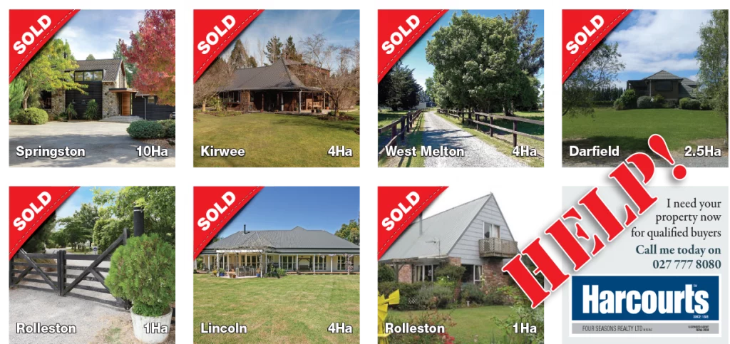
HARCOURTS ROLLESTON

For Richard Tait and Four Seasons Realty in Rolleston, XDC.NZ created promotional material designed to put the agent himself forward — including a flyer featuring Richard to strengthen his personal profile alongside the Harcourts corporate identity.

The work also included logos for subdivisions and various signage and promotional requirements as they arose.


BRAND FIDELITY MATTERS

Working with a major property brand isn’t an opportunity to reinvent the corporate identity.

It is an exercise in getting the details right.

Typography, colours, logos, hierarchy, spacing and application all need to remain faithful to the parent brand while still producing material that works for the local agent and local market.

That’s where experience matters.

XDC.NZ provides local, fast and friendly support while understanding that the finished material still needs to look exactly like it belongs within the wider corporate network.


MORE THAN ONE-OFF DESIGN

XDC.NZ also supports a number of local property agents with advertising for magazines, online campaigns and other promotional requirements, including organising distribution where required.

The value isn’t simply producing one flyer.

It is having someone local who already understands the brand, gets the job right, and can turn around the next requirement without having to start from scratch.


CLIENT TESTIMONIAL

“Nice to deal with a real person who puts his clients first. Have always kept in touch since. Thanks.”

Adam Rogers, Ray White Next Step, Christchurch


THE RESULT

A long-running collection of local property marketing work supporting agents, offices, subdivisions and property campaigns across Christchurch and Rolleston.

Corporate brand standards — with local creative support.


BRAND PILLARS

LOGOfix — Original identity work
GRAPHfix — Flyers, advertising and marketing collateral
SIGNAGEfix — Property and subdivision signage
CRE8Vfix — Local campaign and promotional thinking

PROJECT SNAPSHOT

Clients: Adam Rogers, Ray White Next Step • Richard Tait, Harcourts Rolleston / Four Seasons Realty
Project: Property Marketing, Agent Promotion, Signage & Supporting Graphic Design
Location: Christchurch • Rolleston • Canterbury
Starting point: Established corporate property brands requiring local marketing support
Design: XDC.NZ
Focus: Property Marketing • Brand Fidelity • Local Promotion • Agent Profiles
Positioning: Fast, friendly local design support that works within corporate brand guidelines
Brand Pillars: GRAPHfixLOGOfixSIGNAGEfixCRE8Vfix

Catalynk — Corporate Website Upgrade, SEO & Technical Support

Corporate / Established Business Design | Christchurch

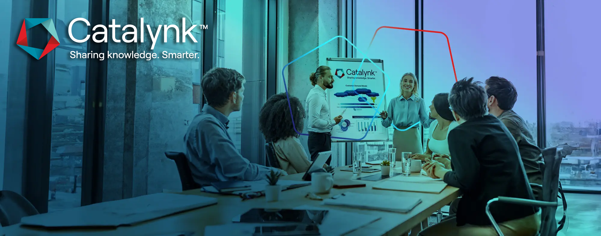
Catalynk  website hero  digital design

Catalynk — Website Upgrade, SEO & Digital Design Support | XDC.NZ

Upgrading an established WordPress site without breaking what already worked — restructuring content and navigation, creating new digital assets, improving SEO, adding functionality and fixing the technical issues holding the site back

THE CHALLENGE

Catalynk had an established WordPress website, but it needed attention.

The objective wasn’t to rip everything out and start again.

It was to identify what could be improved, fix the important issues and create a stronger foundation for future growth — while keeping the existing website operational.


STAGE 1 — QUICK WINS & CORNERSTONE PAGES

XDC.NZ developed a staged approach beginning with the areas that could produce the greatest immediate benefit.

Four to five cornerstone landing pages were identified and developed around the brand’s key areas of expertise.

The work included:

  • Page content
  • Keyword targeting
  • Metadata
  • Page structure
  • Internal linking
  • Heading hierarchy
  • Supporting digital assets

Existing Elementor pages could be duplicated and refined rather than rebuilt unnecessarily.


FIXING THE SITE WITHOUT BREAKING IT

The website also required practical technical support.

XDC.NZ worked through issues as they appeared, including:

  • Broken links
  • Minor styling problems
  • Plugin conflicts
  • Navigation improvements
  • WooCommerce functionality
  • Additional pages
  • Content restructuring
  • RSS implementation

The approach was deliberately pragmatic:

Fix what matters. Improve what can be improved. Don’t rebuild something simply because it is old.


PERFORMANCE

Site performance was also investigated.

With the website hosted in the United States, latency was identified as a potential issue for users in New Zealand as well as international visitors.

XDC.NZ investigated caching, CDN options, image optimisation and unnecessary plugin overhead as part of the wider performance strategy.

Slow-site issues were isolated and reported rather than simply throwing another plugin at the problem.


SEO & TRACKING

The SEO foundation was strengthened alongside the website work.

This included:

  • Metadata
  • Titles
  • Headings
  • Cornerstone content
  • Internal linking
  • Google Analytics 4
  • Google Search Console
  • SEO structure
  • Supporting content

The important point was that SEO wasn’t treated as something to bolt onto the website after the design work.

It was incorporated into the page structure from the beginning.


GRAPHIC DESIGN & DIGITAL ASSETS

The work also included creating and manipulating original digital imagery.

Stock imagery was transformed and blended where appropriate, with Photoshop work used to create more distinctive visuals for the website rather than relying entirely on generic stock photography.

This is where graphic design and website design overlap.

The website needed to look like Catalynk, not simply function like a WordPress website.


PROJECT OUTCOME

“Catalynk came to XDC.NZ with an established but ageing digital presence that needed careful improvement rather than a disruptive rebuild. XDC audited, upgraded and restructured the existing WordPress site, improving navigation, content, SEO, technical performance and supporting assets while keeping the existing platform intact. The project brought together WEBSITEfix, SEOfix, GRAPHfix and ongoing technical support to create a stronger digital foundation without throwing away what was already working.”

Catalynk — Corporate Digital & WEBSITEfix / Upgrade | XDC.NZ


THE RESULT

Catalynk received an ongoing programme of website, SEO, design and technical improvements without the disruption and cost of an unnecessary full rebuild.

The website became a stronger platform for cornerstone content, SEO and future development while retaining the underlying system that already worked.

Sometimes the smartest website redesign is the one that doesn’t require starting again.


BRAND PILLARS

WEBSITEfix — WordPress, Elementor, UX, navigation and technical improvements
SEOfix — Cornerstone pages, metadata, internal linking and SEO foundation
GRAPHfix — Original and enhanced digital imagery
CRE8Vfix — Digital strategy and practical problem-solving

PROJECT SNAPSHOT

Client: Beth / Catalynk
Project: KCS Program Website Audit, Upgrade, SEO & Technical Support
Location: New Zealand / International
Starting point: Established WordPress website requiring improvement rather than a complete rebuild
Design: XDC.NZ
Focus: Website Performance • SEO • Content • UX • Technical Fixes • Digital Assets
Positioning: Upgrade what already works without breaking it
Brand Pillars: WEBSITEfixSEOfixGRAPHfixCRE8Vfix

Inspect Right & Wood ‘n’ Tree — Fixing DIY Websites With Graphic Design Thinking

Digital Graphic Design | Christchurch

Inspect right  website home page

Inspect Right website home page redesigned and optimised by XDC.NZ

Inspect Right’s website home page was rebuilt and refined by XDC.NZ

INSPECT RIGHT — THE PROBLEM

Grant came to XDC.NZ with a website produced using an AI-assisted web platform.

The site had the appearance of a finished website, but underneath the surface there were significant problems.

It wasn’t ranking properly.

The pages weren’t structured around meaningful search intent.

Images hadn’t been properly prepared for the web.

There wasn’t enough meaningful on-page or technical SEO.

And the site wasn’t communicating the business as effectively as it could.


THE FIX

XDC.NZ essentially flipped the script.

Rather than simply replacing the site visually, the existing website was reworked from the inside out.

Images were converted to appropriate web formats, renamed meaningfully and given relevant alt text.

Services were separated into dedicated pages.

Those pages were properly structured and interlinked.

Content was created and rewritten to establish a consistent brand voice.

The footer was rebuilt.

Navigation was improved.

Google Analytics 4 and Search Console were connected.

SEO and GEO considerations were incorporated throughout the site.


CLIENT TESTIMONIAL

“Hi Clint, not 1 call or email from Webador website. Almost think is a scam. Wish now spent your input on Wix website. Put down to learning experience 😊. Re Cool Rides website, will wait on this until get some level of consistent bookings via other channels.”

Grant — Inspect Right, Christchurch


THE RESULT: GRAPHIC DESIGN IS PART OF THE FIX

The important difference was that this wasn’t treated as an SEO-only project.

The visual communication was fixed at the same time.

Images were selected, prepared, cropped and positioned with the same thinking that goes into traditional graphic design.

The result was a website that looked more professional while also providing search engines and users with a much clearer understanding of what Inspect Right actually offers.


PROJECT OUTCOME

The original Webador/AI-built website wasn’t generating meaningful enquiries. XDC.NZ stepped in to restructure the site, improve its service architecture, create and optimise the imagery, strengthen on-page SEO and GEO, connect Google Analytics and Search Console, and build a much stronger digital foundation. The result was a website that could finally compete for search visibility rather than simply exist online.

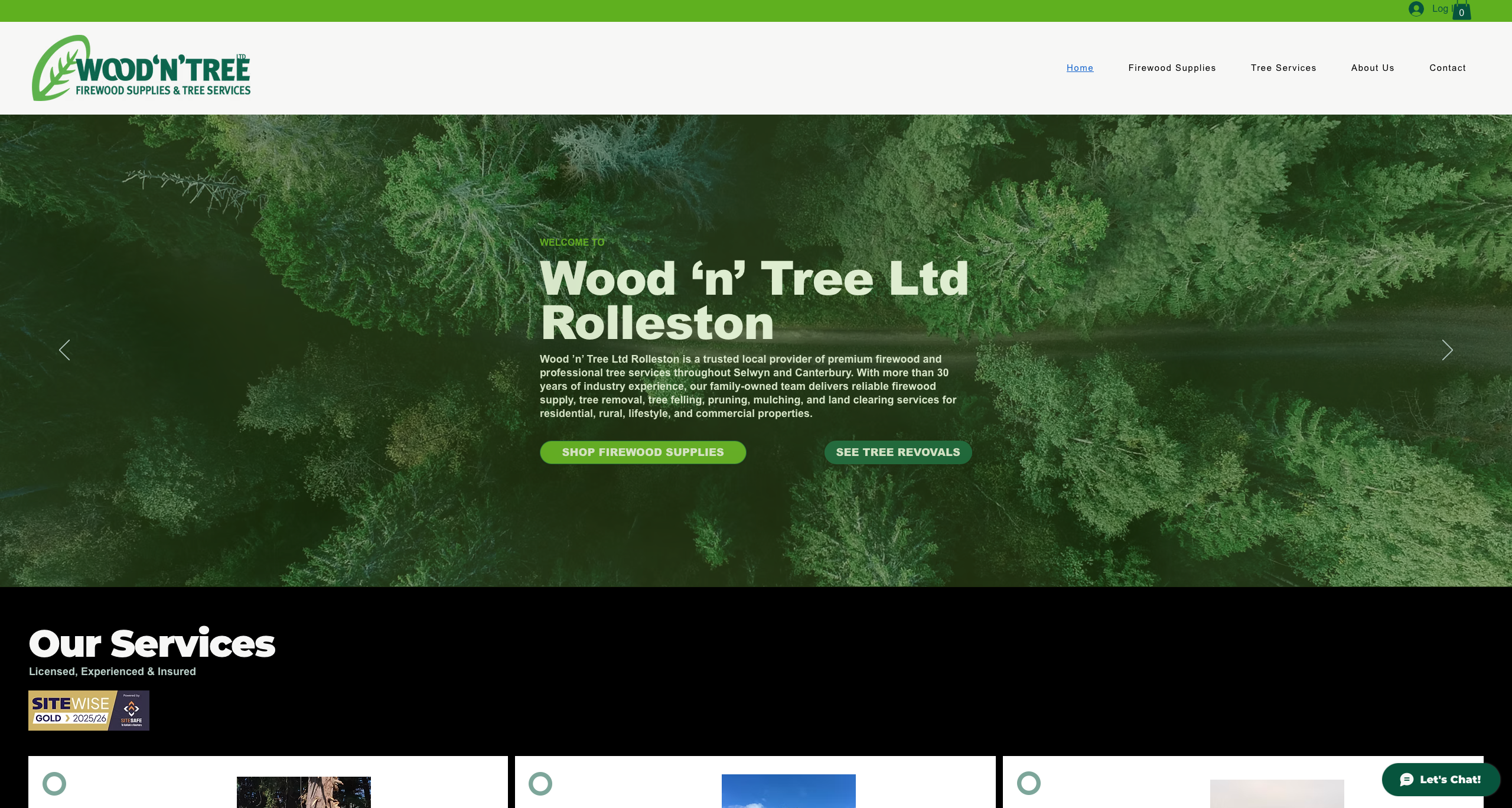
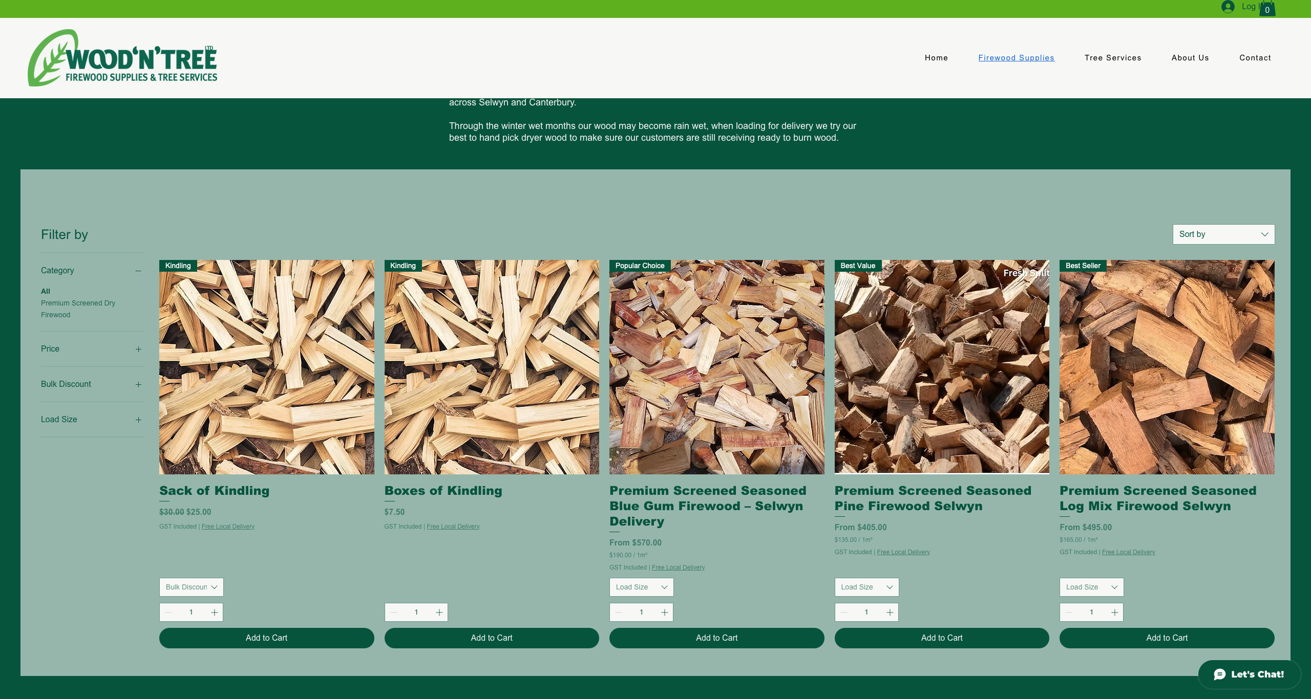
Wood n tree  wix website home page

Wood ’n’ Tree — Wix Website Home Page

Wood ’n’ Tree’s Wix website upgraded with stronger visual design, content and SEO by XDC.NZ

Wood n tree  wix product page

Wood ’n’ Tree — Wix Website Product Page

Wood ’n’ Tree product page redesigned and optimised by XDC.NZ

WOOD ‘N’ TREE — A DIFFERENT VERSION OF THE SAME PROBLEM

Wood ‘n’ Tree is an even longer XDC.NZ relationship.

The business dates back more than 25 years, when XDC.NZ created its original logo and produced print and advertising material.

The next generation of the business brought a Wix website that needed a designer’s eye.

Josh didn’t necessarily need an entirely new website.

He needed the existing site to be designed properly.


THE FIX

XDC.NZ reworked the layout, improved the graphics and strengthened the SEO and GEO foundations.

The website was also transformed into an ecommerce-style experience without turning the business into a conventional ecommerce operation.

The business remained local and personal, but the website became significantly easier for customers to understand and interact with.

Google Business Profile work was also incorporated to reinforce the local presence.


THE RESULT

Once the improved Wood ‘n’ Tree site went live, the phone started ringing and orders came in immediately.

Josh suddenly had the opposite problem:

The website was working — and he couldn’t keep up.

That is the useful side of fixing digital graphic design properly.

It isn’t just about making a website prettier.

It is about making the visual communication, content, structure, search visibility and customer journey work together.


CLIENT TESTIMONIAL

“Clint is very passionate about his work, he done a great job setting up our Woodntree website. Very happy with the result and also starting generating orders and inquiries instantly.”

Josh — Wood ’n’ Tree, Christchurch


THE RESULT

Two very different businesses demonstrate the same XDC.NZ principle:

A website made by an AI platform, DIY builder or previous developer still needs human design thinking.

The technology can build pages.

The designer makes the communication work.


BRAND PILLARS

WEBSITEfix — Website structure, UX and page development
GRAPHfix — Digital graphic design and visual communication
SEOfix — Search optimisation and on-page structure
GOOGLEfix — Google Business Profile and local visibility
CRE8Vfix — Content, creative direction and problem-solving

PROJECT SNAPSHOT

Clients: Grant / Inspect Right • Josh / Wood ‘n’ Tree
Project: Website Upgrade, Graphic Design, SEO, GEO & Digital Visual Communication
Location: Christchurch / Canterbury
Starting point: Self-built / AI-assisted websites requiring significant improvement
Design: XDC.NZ
Focus: Website Design • Visual Communication • SEO • GEO • Google • Digital Graphics
Positioning: Fix the website without losing the business behind it
Brand Pillars: WEBSITEfixGRAPHfixSEOfixGOOGLEfixCRE8Vfix

Campaign / Social Content

Social Media / Campaign Design | Christchurch

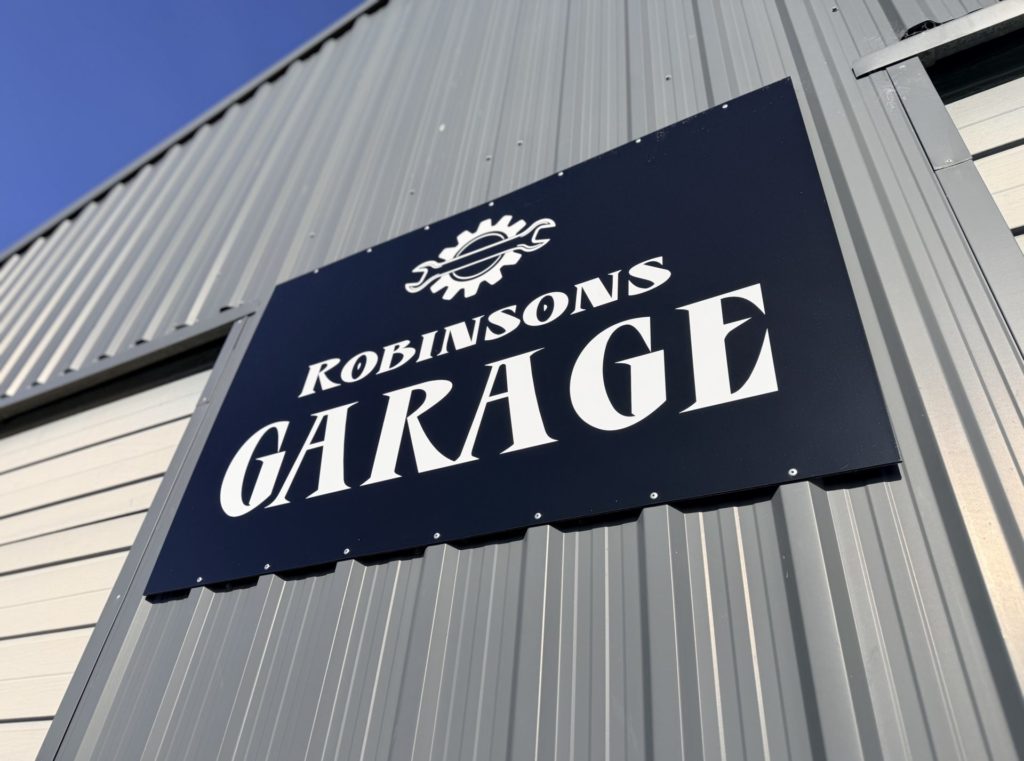
Robinsons garage  local business marketing

Robinsons Garage — Local Business Marketing

XDC.NZ helped Robinsons Garage build its local digital presence across social media, Google and Apple Maps

Country in the country  main cover  social media campaign

Country In The Country — Main Cover & Social Media Campaign

Country In The Country — the first country music festival in Leeston, promoted from the ground up by XDC.NZ

Graphic design doesn’t stop when the artwork is printed.

For many businesses, the real challenge is getting that brand seen, remembered and acted upon — across Facebook, Instagram, Google, websites, email, signage and everywhere else customers encounter it.

This collection shows how XDC.NZ uses graphic design as the visual engine behind social campaigns and digital marketing.


Robinsons Garage — From a Sign in a Paddock to a Local Presence

Wayne owns Robinsons Garage in Prebbleton.

When I first approached him as a local business, the new building was sitting in the middle of a paddock on Robinson Road with essentially nothing behind it except a sign.

We built the digital presence from scratch.

Facebook. Instagram. Google Business Profile. Apple Business Connect / Apple Maps. Photography. Branded graphics. Content.

The objective wasn’t simply to “do social media”. It was to make Robinsons Garage visible to the people who actually lived nearby.


PROJECT OUTCOME

“Robinsons Garage started with little more than a new building, a sign and a great local business owner. XDC.NZ built the digital presence around it — Facebook, Instagram, Google Business Profile, Apple Business Connect, photography and ongoing social content. The result was a local automotive business that people could actually find, recognise and engage with. Facebook reach is now heavily driven by non-followers, showing the content is reaching well beyond the existing customer base, while WOF bookings have taken off.”

Wayne — Robinsons Garage, Prebbleton


THE RESULT

The results were immediate.

Facebook reach grew strongly, with views increasingly coming from people who weren’t already following the business. Non-followers accounted for around 82% of Facebook reach.

The design work created recognition; the platforms created reach; the local targeting created relevance.

Country in the County — Building a Festival from Zero

Country in the County was preparing for its first-ever country music festival in Leeston.

There was no established social audience to work with.


PROJECT OUTCOME

“Country in the County was starting from scratch — a brand-new country music festival with no established social audience. XDC.NZ created and managed the Facebook presence, developed the visual content, produced promotional graphics and teaser videos, and kept the campaign moving throughout the build-up to the first festival. What started as a blank social page grew into a genuine community audience, with the festival now attracting more than 32,000 followers and 96% of Facebook reach coming from people who don’t already follow the page.”

Country in the County — Leeston, Selwyn


THE RESULT

XDC.NZ helped establish the Facebook presence, developed the visual style, created graphics and content, produced teaser videos and continually fed the campaign with fresh material.

The objective was simple:

Make people know it was happening.

The campaign grew from nothing into a substantial audience, with more than 32,000 followers and approximately 96% of reach coming from non-followers.

That’s what good campaign design is supposed to do — get outside the existing audience.

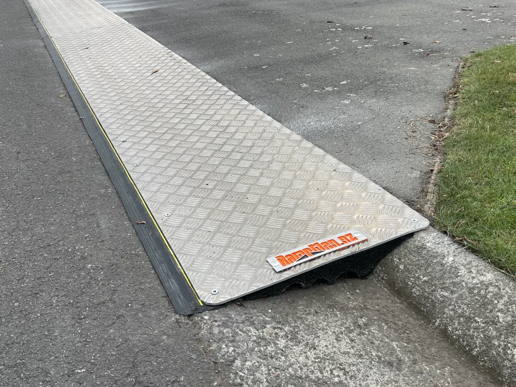
Therampman Nz  8mm semi height ramp

TheRampMan.NZ — 8mm SEMI-Height Ramp

8mm SEMI-Height aluminium ramp with folded leading edge and protective rubber edging, made by TheRampMan.NZ

Kerby Nz  powdercoated gutter ramp detail

KERBY.NZ — Powder-coated Gutter Ramp Detail

KERBY.NZ gutter ramp in Rolleston, featuring a durable powdercoated finish and glow-in-the-dark visibility line

CLIENT TESTIMONIAL

“Building TheRampMan.NZ has been a fantastic example of what happens when you put proper design, branding and marketing behind a good product. XDC.NZ has been involved from the very beginning — from the logo and website through to SEO, social media, photography, content and the whole brand voice. It’s grown into a recognisable NZ-made brand with a personality of its own, and I’m pretty bloody proud of where we’ve taken it.”

Clint, Founder, TheRampMan.NZ, Christchurch


TheRampMan.NZ — Graphic Design Meets Brand Voice

TheRampMan.NZ is a particularly strong example of graphic design becoming an entire digital ecosystem.

XDC.NZ manages the website, social content and ongoing brand communication, developing everything from campaign concepts and graphics to the quirky brand voice that makes the business recognisable.

The brand isn’t trying to look like every other engineering or fabrication company.

It has personality.

It has humour.

It has a visual language.

And it has a reason for people to stop scrolling.

Recent Facebook performance has exceeded 68,000 views, with views up around 118%, 3-second video views exceeding 7,000 and watch time up around 167%.

Approximately 99.6% of those views are from non-followers.

That is a powerful indication that the content is reaching well beyond the existing customer base.

CLIENT TESTIMONIAL

“KERBY® started with a product idea, but I wanted it to become a proper local brand. XDC.NZ built everything around that idea — the identity, website, photography, SEO, social content and the personality that makes KERBY® different. It’s been great watching a hyper-local Selwyn brand get noticed by thousands of people who didn’t even know we existed.”

Clint, Founder, KERBY.NZ, Christchurch


KERBY.NZ — The Hyper-Local Version

KERBY.NZ takes a similar approach but turns the geographic dial right down.

The brand is deliberately hyper-local, focusing on Selwyn and surrounding areas including Rolleston, Lincoln, West Melton, Prebbleton, Pegasus and Ashburton.

XDC.NZ manages the Wix website and social content, creating the visual material, campaigns and brand voice that make the product instantly recognisable.

The results have included more than 71,000 views, more than 4,000 3-second views, increased watch time and more than 99% non-follower reach.

CLIENT TESTIMONIAL

“Clint has been an amazing marketer of my website at an affordable price. He updates my SEO regularly, keeping my website relevant to Google. His insights and knowledge is outstanding. Thank you Clint. I love that I can leave this part of my business in your hands and see the amazing results of your dedication in my business.”

Linda, Klox Business Solutions (Klox Ltd) — Bookkeeper, Christchurch


Klox — Keeping a Local Business Visible

Klox is a local bookkeeping business using RocketSpark.

XDC.NZ manages the SEO and ongoing digital visibility, keeping the website working as an active business asset rather than simply leaving it online.

The graphic design principles still matter: clear communication, consistent presentation and making sure the business looks credible wherever customers encounter it.

PROJECT OUTCOME

“The Boulevard’s website was showing its age. XDC.NZ took on the challenge of bringing an antiquated SilverStripe site up to modern standards without throwing away the existing platform. The website was completely revitalised with new photography, improved structure, content, SEO, local optimisation and ongoing technical management. Within around six weeks, website traffic was up an extraordinary 991% — turning an ageing website into a much more effective digital presence for this Christchurch retirement village.”

Karen, The Boulevard Retirement Village, Christchurch


The Boulevard — Bringing an Older Website Back to Life

The Boulevard retirement village is another example of graphic design and content working alongside a website transformation.

The existing SilverStripe website had become dated and difficult to work with.

XDC.NZ undertook a substantial WEBSITEfix, including content, imagery, structure, SEO improvements and a complete photography project covering the village and its units.

A drone photography series was also commissioned to provide marketing imagery.

The website became more than an online brochure. It became a proper visual representation of the village.

The work continues to be monitored and refined, with significant increases in website performance following the changes.

PROJECT OUTCOME

“XDC.NZ helped take Linens & Treasures from a home-based online business to a genuine retail presence at Barrington Mall. Managing the Shopify website alongside the social media presence, the focus was on keeping the brand active, visible and commercially useful across multiple platforms. Within a year, the business had moved into a physical mall store and grown to the point of employing additional staff.”

Jill, Linens & Treasures, Christchurch


Linens & Treasures — Digital Design Supporting Physical Growth

Linens & Treasures began as a home-based shop.

XDC.NZ manages the Shopify website and social content, helping Jill move from an online/home-shop operation into a physical retail presence at Barrington Mall.

This is another example of the same principle:

Design isn’t decoration. It’s business communication.

From website graphics to social content and ongoing digital presentation, the brand has to work wherever the customer encounters it.

The Bigger Picture

These projects demonstrate why XDC.NZ doesn’t treat graphic design, websites, SEO and social media as separate silos.

A graphic designer who understands websites can design better web content.

A designer who understands SEO can create more useful pages.

A designer who understands social media can create content people actually stop to look at.

And a designer who understands business can connect all of those pieces.

That’s the XDC.NZ approach:

Design it. Brand it. Publish it. Promote it. Measure it. Improve it.


BRAND PILLARS

WEBSITEfix — Website structure, UX and page development
GRAPHfix — Digital graphic design and visual communication
SEOfix — Search optimisation and on-page structure
GOOGLEfix — Google Business Profile and local visibility
CRE8Vfix — Content, creative direction and problem-solving

PROJECT SNAPSHOT

Clients: Robinsons Garage • Country in the County • TheRampMan.NZ • KERBY® • Klox • The Boulevard • Linens & Treasures
Project: Campaign, Social Media & Multi-Platform Content
Location: Christchurch • Selwyn • Canterbury • New Zealand
Design: XDC.NZ
Focus: Social Content • Campaign Design • Local Visibility • Brand Voice • Digital Design • Content Creation
Brand Pillars: BUZZfixGRAPHfixWEBSITEfixSEOfixGOOGLEfixCRE8Vfix
Positioning: Turning good local businesses into visible local brands

Melton Estate Winery, Stack Electrical & PlaceMakers Christchurch

Packaging / Product Design / Product Graphics | Christchurch

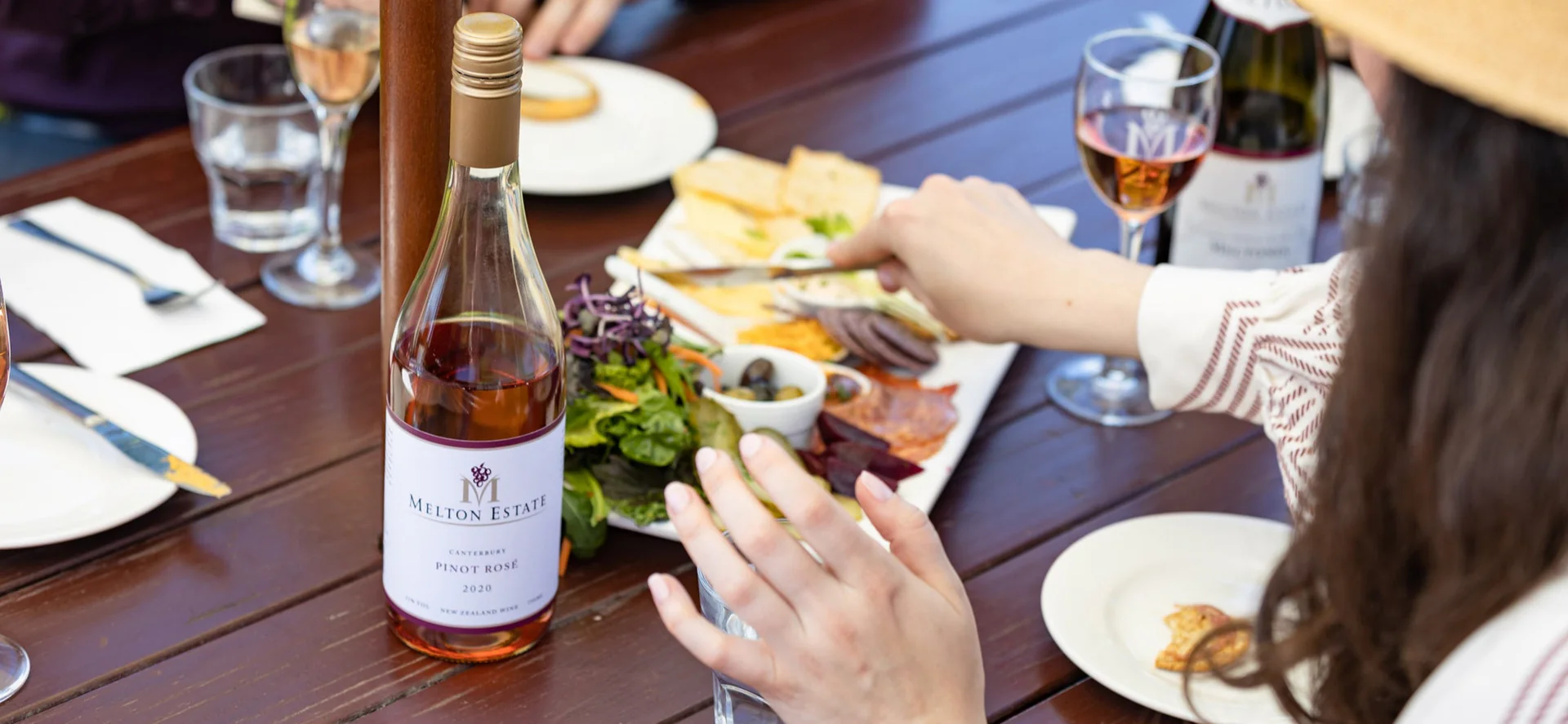
Melton estate  wine label  lifestyle photography

Melton Estate — Wine Label & Lifestyle Photography of the Wine Label

Melton Estate wine and food lifestyle imagery supporting the brand, packaging and marketing created by XDC.NZ

Packaging design is often where graphic design becomes tangible.

It is something customers can hold, see, pick up, photograph, display and remember.


PROJECT OUTCOME

“Melton Estate is a long-standing XDC.NZ brand relationship spanning more than 25 years, with the original brand identity continuing to evolve across wine labels, packaging, print, signage and marketing. XDC.NZ designs and refines the labels and packaging that give each wine its own personality while keeping the wider Melton Estate identity connected and recognisable. From bottle labels and wine presentation through to promotional material and physical signage, the design has to work as part of the complete winery experience — on the shelf, in the cellar door, at the table and across the wider brand.”

Phillip, Melton Estate Winery — West Melton, Canterbury


Melton Estate Winery — A Brand Built Over Decades

Melton Estate Winery is one of the long-standing XDC.NZ relationships.

More than 25 years ago, XDC.NZ created the Melton Estate brand as Phil established the vineyard and winery.

From the original identity came a wide range of supporting design work.

Tri-fold brochures.

Rack cards.

Wine labels.

Wine bottle photography.

Posters.

Signage.

Website assets.

Marketing material.

The design has evolved as the business has evolved, while maintaining the recognisable character of the brand.

Wine labels are particularly important because the label becomes the customer’s first physical interaction with the product.

Photography is equally important.

Rather than simply photographing a bottle, the objective is to create an environment and visual mood around the wine — food, people, place and experience.

Stack electrical presentation folder  after inside cover artwork

Complete Flat Outside Cover Artwork: AFTER

XDC design of the new presentation folder (unfolded)

Packaging design is often where graphic design becomes tangible.

It is something customers can hold, see, pick up, photograph, display and remember.


PROJECT OUTCOME

“Stack Electrical had stopped using its old presentation folder because it was basic, flat and simply wasn’t doing the business justice. XDC.NZ used the direction and visual language of their new website as the starting point, then developed a much stronger presentation folder designed to give Stack Electrical the professional edge needed for quotes, tenders and client presentations. The finished folder was presented as a 3D visual so the team could see exactly how it would look before production, then printed locally in Christchurch. The success of the folder led directly into a wider suite of six Capability Statements covering Bitumen, Breweries & Distilleries, Commercial, Generic, Hydrogen & Biogas and Industrial work — making tender preparation faster, easier and far more consistent.”

Stack Electrical — Christchurch


Stack Electrical — Presentation That Wins Its Space

Stack Electrical came to XDC.NZ because their existing presentation folder wasn’t doing the job.

It was basic, flat and uninspiring.

In fact, they had allowed the folders to run out because they weren’t getting used.

Using the new website as a visual foundation, and working closely with the director, XDC.NZ developed a completely new presentation folder.

The design was presented as a 3D visualisation so the client could see how the finished folder would look before committing to production.

They loved it.

The project then expanded into six Capability Statements covering:

  • Bitumen
  • Breweries & Distilleries
  • Commercial
  • Generic
  • Hydrogen & Biogas
  • Industrial

Suddenly tenders became much easier to assemble.

The company had a consistent visual system, professional presentation and a set of documents that could be selected according to the opportunity.

Local Christchurch printing was also arranged at a highly competitive price.

Placemakers  custom staff recognition star

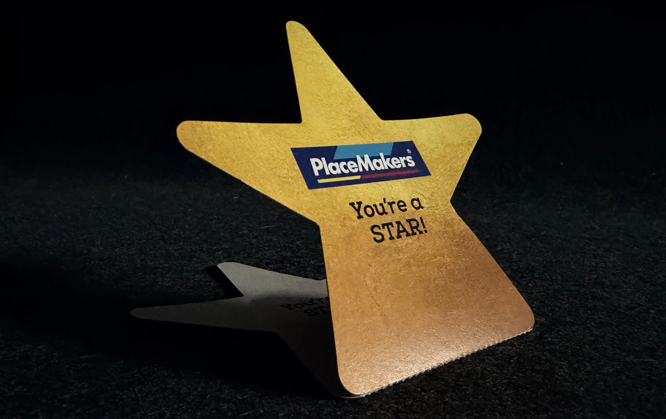
PlaceMakers — Custom Staff Recognition Star

Custom die-cut PlaceMakers Star designed by XDC.NZ for staff recognition and workplace morale

PROJECT OUTCOME — PlaceMakers Staff Recognition Star

“PlaceMakers needed something more meaningful than another piece of generic staff recognition material. XDC.NZ created a custom die-cut star-shaped piece for in-house use, designed around the idea of recognising staff who go “over and above”. The front features the PlaceMakers brand prominently, while the personalised section can be torn away along the perforation, written on and displayed on the staff noticeboard. The other half becomes a presentation piece for the staff member being recognised. Even the “gold” effect was created within the artwork rather than relying on expensive foil finishing, keeping production practical while still giving the piece the visual impact it needed.”

PlaceMakers Christchurch — Internal Staff Recognition


PlaceMakers Christchurch — Turning a Staff Idea into a Physical Piece

Sometimes, packaging and product design aren’t about selling a product.

It’s about selling an idea internally.

For PlaceMakers Christchurch, XDC.NZ designed a custom die-cut star-shaped piece for staff recognition.

The front incorporated the PlaceMakers branding and a perforated section that could be removed.

The employee’s name could then be written on the piece and displayed on the staff noticeboard alongside a note explaining what they had done “over and above”.

The other section became a presentation piece for the staff member.

The challenge was producing the appearance of gold without relying on expensive foil production.

The artwork was therefore constructed to visually simulate the gold effect while retaining the practical production requirements.

A simple piece of paper became a staff recognition system.


Why Packaging Design Matters

Packaging, labels and presentation material have one thing in common:

They have to work in the real world.

They need to look good, reproduce properly, suit the production method and communicate the right message at the point of contact.

That’s where 25+ years of practical graphic design experience matters.


BRAND PILLARS

GRAPHfix — Creative innovative designs
CRE8Vfix — Creative campaign direction
miPACKAGE — Integrated business solution

PROJECT SNAPSHOT

Clients: Melton Estate Winery • Stack Electrical • PlaceMakers Christchurch
Project: Packaging, Product Graphics & Presentation Materials
Location: Christchurch • West Melton • Canterbury
Design: XDC.NZ
Focus: Packaging • Labels • Presentation Folders • Product Graphics • Photography • Internal Communications
Brand Pillars: GRAPHfixmiPACKAGECRE8Vfix
Positioning: Making products, packaging and printed material work harder

Complex Information Made Simple

Information Design / InfoGraphics | Christchurch, New Zealand & Australia

Metservice  newspaper infographics  information design

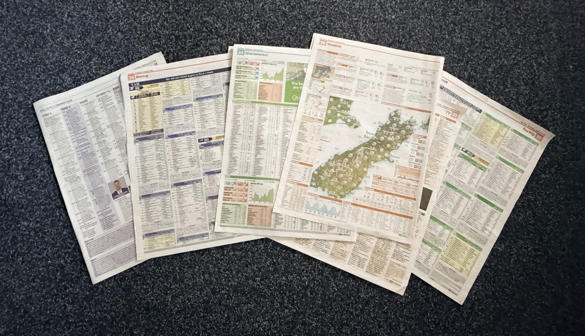
Newspaper Infographics & Information Design

Selection of complex newspaper graphics for TV listings, weather, stock exchange, TAB, and horse racing

Some graphic design projects aren’t about making something pretty.

They’re about making something complicated work.


From Data to Designed Information

Clint was head-hunted into a rolling contract arrangement and worked with MetService Christchurch for around 30 years.

The work expanded into highly specialised information graphics for newspapers and other media organisations.

The first major challenge involved television listings.

Custom templates were developed for different newspaper clients and connected to database-driven production systems.

The process involved:

  • Receiving and interpreting different file formats
  • Working with developers
  • Helping design the production GUI
  • Connecting data to layout systems
  • Building client-specific templates
  • Automating the flow of information
  • Producing future-dated publications
  • Creating production checks to ensure the information displayed correctly

A user could select a date and client, push a button and, after processing, receive a populated newspaper-ready graphic.


Then It Got Much More Complicated

The work expanded beyond TV listings.

TAB betting graphics.

Super 12 Rugby graphics.

Horse racing.

Greyhound racing.

Stock Exchange graphics.

NZX and ASX information.

International market indexes.

And eventually highly detailed weather graphics.

The weather work required complex combinations of data, icons, maps and visual hierarchy.

The objective was to transform huge quantities of technical information into a graphic that a newspaper reader could understand quickly.


Design + Technology

This work sits at the intersection of graphic design, information design, production technology and programming.

InDesign became increasingly programmable, particularly through AppleScripts.

The production process became increasingly database-driven.

That meant the designer needed to understand not only typography and layout but also how the information itself was structured and how it travelled through the production system.

The resulting graphics had to be attractive, accurate and production-safe.


PROJECT OUTCOME — MetService Newspaper & Data-Driven Infographics

“For more than 30 years, XDC.NZ was trusted with some seriously complex information — turning huge volumes of weather, racing, financial and television data into clear, production-ready newspaper graphics. Working with MetService, newspaper publishers and developers, I helped create systems that could take structured data, process it through database-driven workflows and automatically populate carefully designed templates for publication. The work evolved from TV listings into TAB Super Rugby graphics, horse racing and greyhound information, NZX and ASX stock-market graphics, and eventually highly detailed MetService weather maps and full-page newspaper graphics.

The challenge wasn’t simply making the graphics look good. They had to be accurate, repeatable, technically robust and understandable at a glance — with production teams able to sanity-check the data before publication. It was a rare combination of graphic design, information design, database thinking, automation and production knowledge.”

MetService / NZ & Australian Newspaper Graphics — XDC.NZ


Why This Matters Today

Modern digital design has made information even more complex.

Dashboards, websites, data visualisations, AI-generated content and automated publishing systems all produce enormous quantities of information.

The fundamental design problem hasn’t changed:

How do you make complicated information easy to understand?

That’s information design.

PROJECT SNAPSHOT

Client: MetService New Zealand / New Zealand & Australian Media
Project: Automated Information Graphics, Weather Graphics, TV Listings & Infographics
Location: Christchurch • New Zealand • Australia
Design: XDC.NZ
Focus: Information Design • Data Visualisation • Newspaper Graphics • Automation • Database-Driven Publishing
Positioning: Turning enormous amounts of information into something people can understand

Best Before/After Transformation— The Big Transformations

Graphic Design / Visual Communications / Website Design | Christchurch

Filathonites  mount athos pilgrim maps website

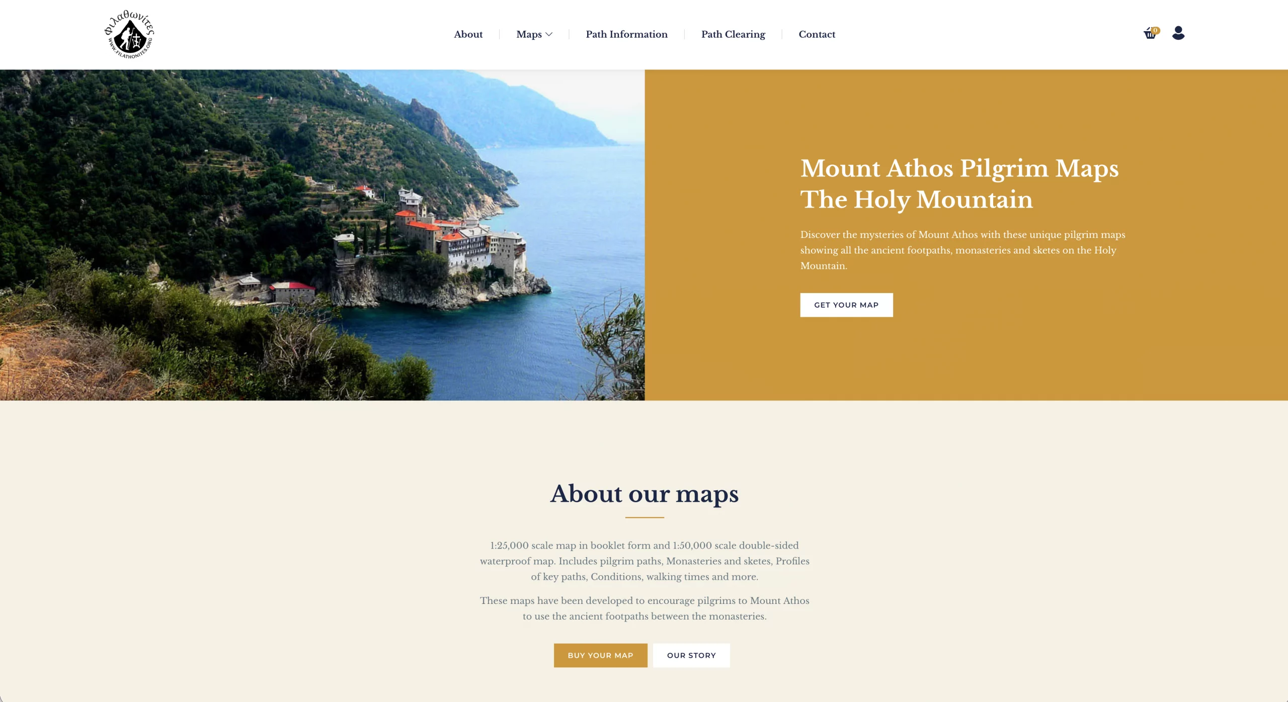
Filathonites — Mount Athos Pilgrim Maps Website

Filathonites website created by XDC.NZ for Peter Howarth and his Mount Athos pilgrim maps

Peter Howarth came to XDC.NZ with a very specialised product and a very specific audience.

Filathonites needed a professional WordPress website to present and sell its Mount Athos pilgrim maps.

The product itself is highly specialised:

Mount Athos Pilgrim Maps — The Holy Mountain

The maps document ancient footpaths, monasteries and sketes across Mount Athos.

The challenge was taking something that could easily feel niche, complicated and inaccessible and turning it into a clear, credible online proposition.

XDC.NZ built the WordPress website and developed the content and presentation around the maps.

The transformation was not simply cosmetic.

The website became the sales environment.


CLIENT TESTIMONIAL

“I discovered Clint, and got him to do a revamp of my website, that had been unchanged for some 10 years, when we thought that it was looking a bit tired. One of the most encouraging things that happened was that Clint took a real effort to try and understand what our business was about, rather than just as a straight commercial enterprise. This was extremely refreshing and he was able to contribute in ways that showed the benefit of taking this approach. I would thoroughly recommend Clint is approachable, quick, and makes a real effort. Thanks Clint!”

Peter, Filathonites, Christchurch


THE RESULT?

Once the site went live, sales began arriving from around the world.

The project is a good example of what happens when specialist knowledge, good presentation and a properly structured website are brought together.


Before: A specialist product needing a professional digital home.

After: A worldwide sales channel.

PROJECT SNAPSHOT

Client: Filathonites / Peter Howarth
Project: WordPress Website & Digital Content Transformation
Location: New Zealand / International
Design: XDC.NZ
Focus: Website Design • Content Creation • Information Architecture • Product Presentation
Brand Pillars: WEBSITEfixGRAPHfixSEOfix
Positioning: Turning a specialist idea into something the world can actually buy

Community / Pro Bono / Local Contribution
Community & Local Business | Christchurch

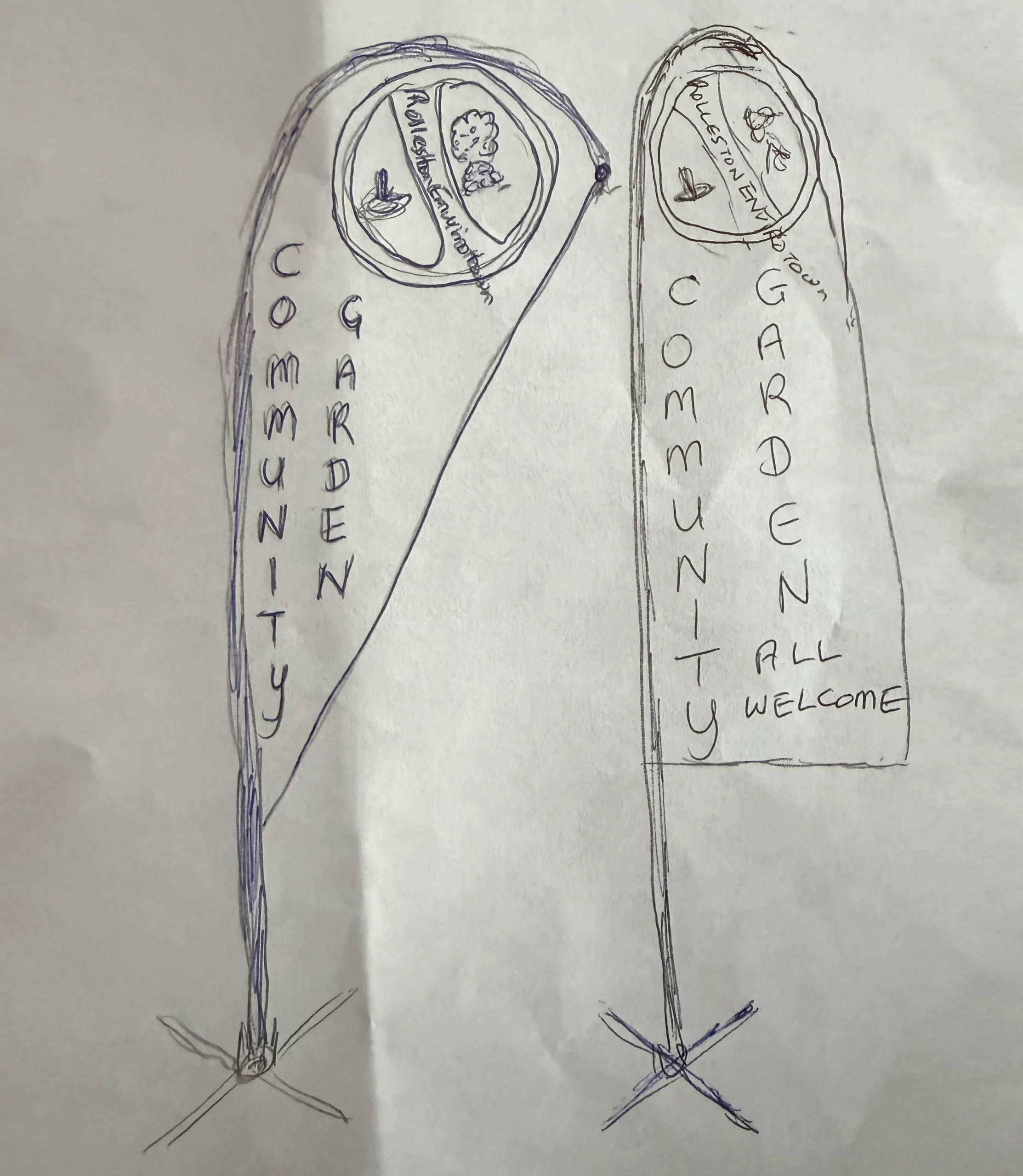
Rolleston community gardens  before

Rolleston Community Gardens: BEFORE

Original supplied concept for Rolleston Community Gardens signage

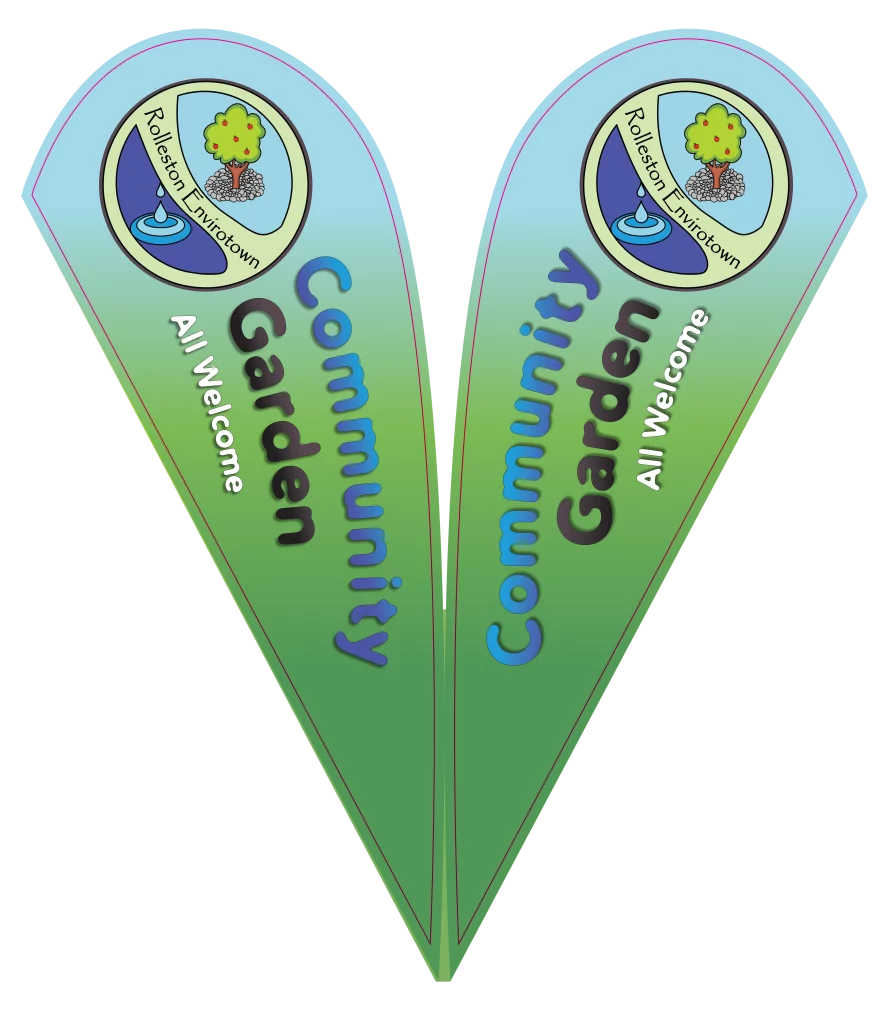
Rolleston community gardens  final signage

Rolleston Community Gardens — Final Signage: AFTER

Final Rolleston Community Gardens teardrop flag signage designed by XDC.NZ

XDC.NZ doesn’t only design for businesses.

Being part of a local community means occasionally putting professional skills to work where they can make a difference.


Rolleston Community Gardens

The Rolleston Community Gardens project began with a rough sketch and a committee with a vision.

The challenge was turning that early idea into something that looked inviting, recognisable and professionally considered.

XDC.NZ worked through the visual communication fundamentals:
  • Logo development
  • Colour selection

  • Typography
  • Hierarchy
  • Signage layout
  • Visual recognition
  • Practical production considerations

There were meetings, discussions and plenty of explaining why things needed to sit where they did.

That’s part of being a professionally trained designer.

Sometimes the job isn’t simply making something look good.

It’s explaining why it works.

The final direction used a friendly colour palette, approachable typography and a more compelling visual identity.

The result was signage that felt like it belonged to a community garden rather than looking like a generic noticeboard.

XDC.NZ also kept the costs as close to cost-plus-GST as possible to help the community project achieve the result without unnecessary expense.


CLIENT TESTIMONIAL

“As we all agree, it’s Design No. 4 that’s come up trumps, so can you please start the ball rolling so to speak. If you send me the invoice I’ll ensure it gets paid asap. Thanks for all your work on this to date.”

Bruce — Rolleston Community Gardens Committee, Selwyn


THE RESULT? Design for the Community

Clint has also been involved in the Selwyn business community for many years, including establishing the Selwyn Business Group in 2011.

Community involvement is part of the wider XDC.NZ philosophy:

Good design should be accessible, practical and useful — not reserved for businesses with enormous marketing budgets.

PROJECT SNAPSHOT

Client: Rolleston Community Gardens
Project: Community Garden Signage & Brand Presentation
Location: Rolleston, Selwyn
Design: XDC.NZ
Focus: Community • Signage • Visual Communication • Brand Identity • Design Education
Positioning: Good design should help good community projects succeed

Responsible Business / Award

Responsible Business | Christchurch

Therampman Nz  stacked master logo

TheRampMan.NZ — Stacked Master Logo

TheRampMan.NZ stacked master logo created by XDC.NZ as part of the complete brand identity.

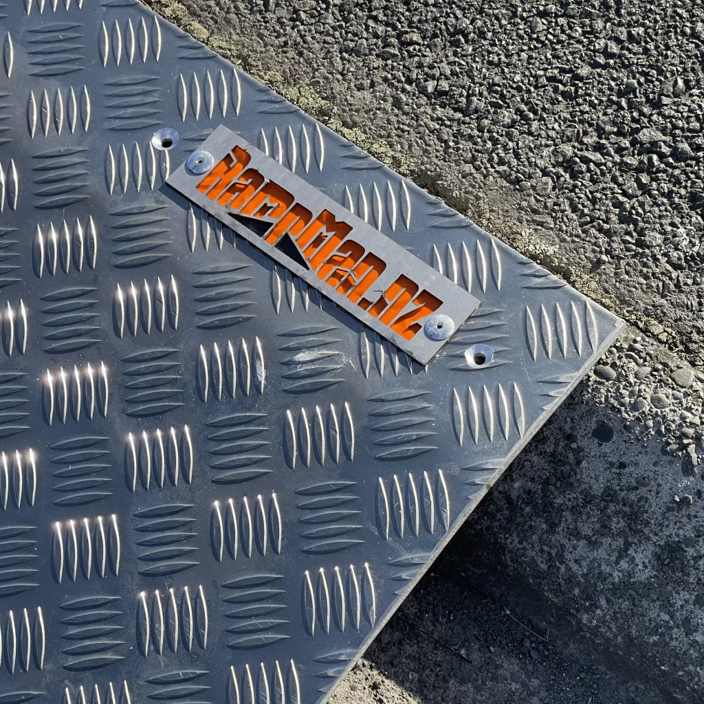
Therampman Nz  laser cut logo on ramp

TheRampMan.NZ — Laser-Cut Logo on Ramp

TheRampMan.NZ laser-cut logo integrated into an 8mm aluminium ramp, connecting the brand directly to the product.

TheRampMan.NZ is a particularly good example of how the XDC.NZ Brand Pillars can work together.

XDC.NZ helped establish the business from the ground up.

Logo.

Brand identity.

Website.

SEO.

Google Business Profile.

Social media.

Graphic design.

Content creation.

Brand voice.

Marketing.

And ongoing digital management.

But the project developed into something bigger.


A Brand with a Purpose

TheRampMan.NZ manufactures access ramps in New Zealand.

The business has developed innovative products using recycled vehicle tyres alongside aluminium.

Instead of relying solely on aluminium, recycled rubber can perform structural and cushioning functions in specific ramp applications.

That means less aluminium can be required in some designs while giving discarded tyres another useful life.

The business also actively looks at the waste produced during manufacturing.

Aluminium swarf is recovered.

Packaging is recycled.

Composting and recycling are part of the operation.

Even the workshop concrete has been vacuumed to recover aluminium swarf rather than allowing it to simply disappear into the environment.

The business is also investigating bio-epoxy solutions for binding recycled rubber crumb.

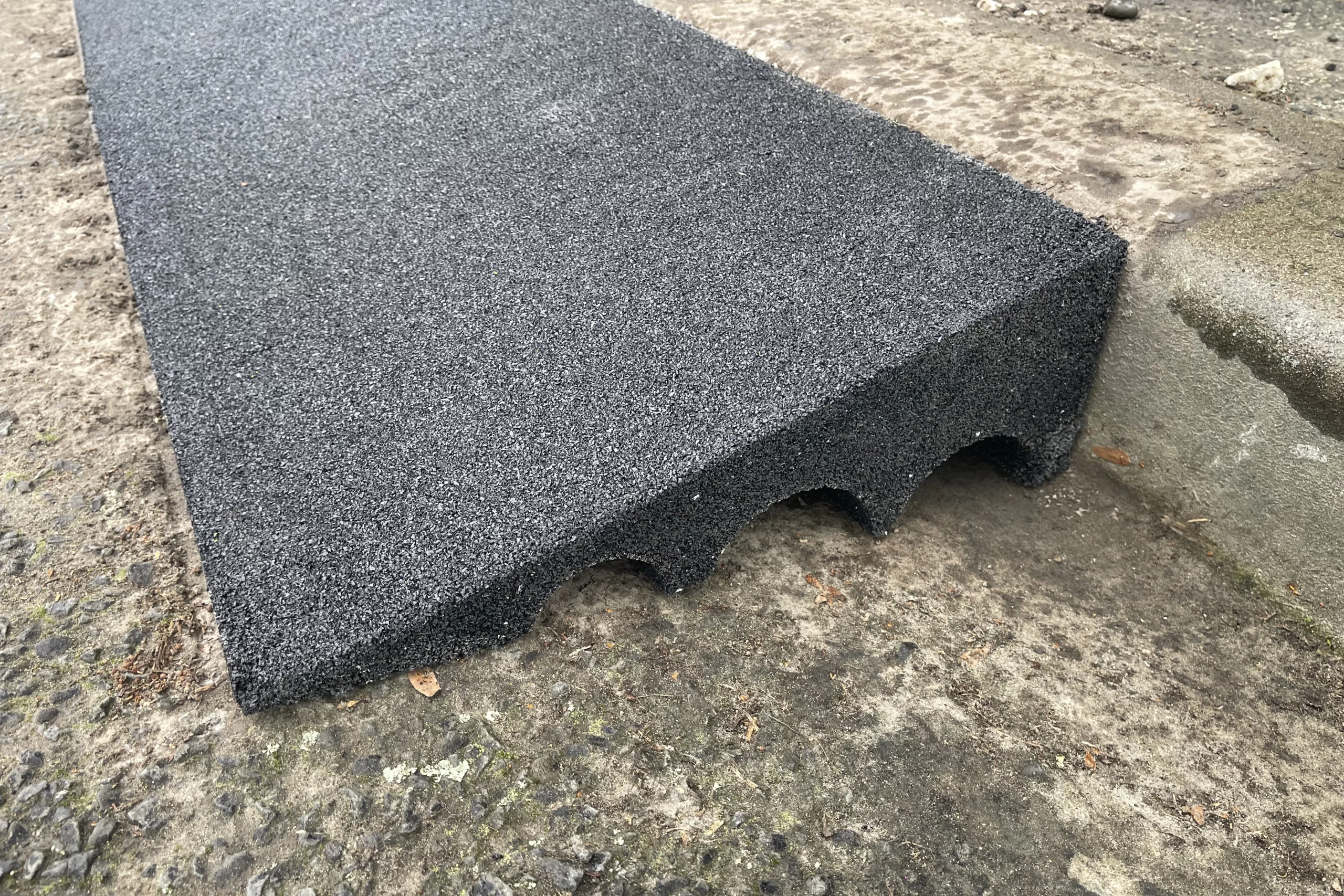
Therampman Nz  loadbeam™ recycled rubber wedge

TheRampMan.NZ — LoadBeam™ Recycled Rubber Wedge

LoadBeam™ recycled rubber wedge shown independently to reveal the foundation of TheRampMan.NZ full-height road ramp.

Therampman Nz  loadbeam™ full ramp system

TheRampMan.NZ — LoadBeam™ Full Ramp System

LoadBeam™ recycled rubber wedge with 8mm aluminium plate fitted on top, showing the complete full-height ramp concept.

From Product to Brand

The design challenge was to make sustainability part of the brand story without making the business look worthy-but-dull.

TheRampMan.NZ needed personality.

It needed humour.

It needed a distinctive voice.

It needed to make engineering approachable.

That’s where graphic design, CRE8Vfix and BUZZfix became just as important as the physical product.

The brand now has a recognisable visual and verbal ecosystem across its website, social media, products and marketing.


CLIENT TESTIMONIAL

“We’re constantly looking for ways to do things better for the environment. At TheRampMan.NZ, we recycle and reuse wherever we can, from turning old car tyres into strong ramp components rather than sending them to landfill, to reducing aluminium use, recycling our offcuts and packaging, and keeping our workshop waste to a minimum. Even the aluminium swarf gets vacuumed up rather than ending up in the environment. It’s not about claiming to be perfect — it’s about finding better ways to make things, one ramp at a time, and keeping as much waste as possible out of the environment.”

Clint, Founder, TheRampMan.NZ


THE RESULT? A Responsible Business

The sustainability work has also been recognised by the Selwyn responsible business community.

XDC.NZ itself was a Gold Winner in the Selwyn Responsible Business Awards 2019 for Community & Environmentally Sustainable Business Practices.

The philosophy continues today through local suppliers where practical, sustainable printing methods, bio inks, recycling and responsible production.

This is where graphic design connects to something bigger.

“A brand isn’t just what you say about a business.

It’s what the business actually does.”

PROJECT SNAPSHOT

Client: TheRampMan.NZ
Project: Brand, Digital & Sustainable Business Transformation
Location: Rolleston • Selwyn • Christchurch • New Zealand
Design: XDC.NZ
Focus: Branding • Graphic Design • Website • SEO • Social Media • Sustainable Design • Content Creation
Brand Pillars: All BPs (miPACKAGE)
Positioning: Building a business brand around better thinking, not just better marketing

Graphic Design Connected to Other Brand Pillars

Multi-Brand-Pillar Project | Christchurch

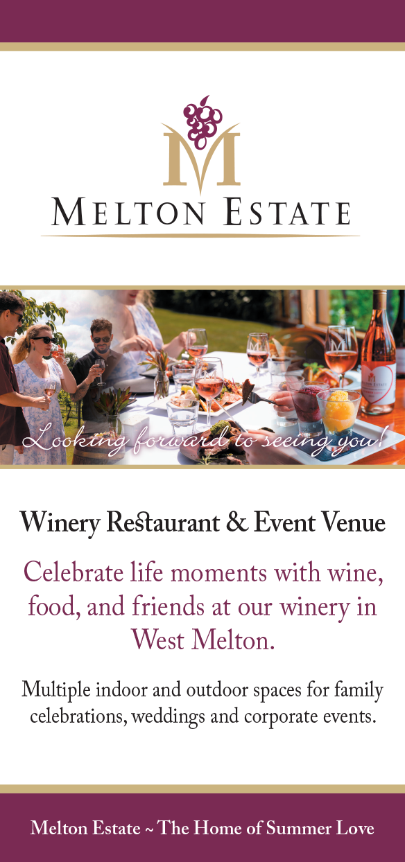
Melton estate  2026 rack card front

Melton Estate — 2026 Rack Card Front

Melton Estate Winery 2026 rack card front, designed and refined by XDC.NZ.

Melton estate  2026 rack card back

Melton Estate — 2026 Rack Card Back

Melton Estate Winery 2026 rack card back, continuing the brand and marketing system developed by XDC.NZ.

Melton Estate is one of the clearest examples of why XDC.NZ treats Graphic Design as a core pillar connected to everything else.

The relationship began more than 25 years ago.

Phillip had purchased an existing restaurant and vineyard operation and needed to establish a distinctive identity and communicate what the business could become.

XDC.NZ created the logo and began developing the supporting visual material.


From Vineyard to Experience

The early marketing included a tri-fold brochure communicating the vineyard, winery, restaurant, and experience.

That artwork was then adapted into rack cards for the venue and flyers for local distribution.

The objective was to create awareness around the region and encourage people to discover the venue.

Over time, the visual story developed.

Wine.

Food.

People.

Weddings.

The vineyard.

The restaurant.

The experience.


Everything Has to Feel Like Melton Estate

The same design thinking flowed into:

  • Wine labels
  • Wine bottle photography
  • Website imagery
  • Signage
  • Door posters
  • Rack cards
  • Brochures
  • Marketing material
  • Wedding promotion
  • Print advertising
  • Digital assets

The tri-fold has continued to evolve over the years, with new photography and updated content keeping it relevant while retaining the underlying identity.

Melton estate  illuminated signage at dusk

Melton Estate — Illuminated Signage at Dusk

Melton Estate signage illuminated at dusk, with the winery restaurant and vineyard setting providing the backdrop.
Posters near the doors, and the illuminated Icon on top of the building in the gable.

Graphic Design as the Connector

The packaging needed to feel like the brand.

The signage needed to feel like the brand.

The photography needed to feel like the brand.

The brochures needed to feel like the brand.

The website needed to feel like the brand.

That’s the real value of a connected Brand Pillar approach.

Graphic design isn’t simply one thing you order.

It is the visual glue holding the customer experience together.

The website may have been built by another member of the family, but XDC.NZ supplied the visual assets and supported the business with SEO and design input.


PROJECT OUTCOME — Melton Estate | Brand Pillar Connector

“Melton Estate is one of the clearest examples of XDC.NZ’s Brand Pillars working together over time. What started more than 25 years ago with the original brand identity developed into a connected suite of graphic design, print, signage, photography, packaging and marketing material. XDC.NZ created the original tri-fold brochure, then adapted the artwork into rack cards, posters and other promotional pieces as the business grew. Wine labels and packaging extended the brand onto the product itself, while photography, signage and environmental graphics carried it into the winery and restaurant.

The brand has continued to evolve rather than being repeatedly reinvented — new photography, refreshed collateral and updated promotional material keep Melton Estate current while maintaining the identity people already recognise. It’s a great example of the value of having one designer who understands the brand across multiple touchpoints and can connect the dots between them.”

Melton Estate Winery — West Melton, Canterbury


THE RESULT? 25+ Years Later…

The relationship continues.

That’s perhaps the strongest testimonial of all.

A brand created more than two decades ago can continue to evolve without losing its identity when the underlying design thinking is strong enough to support it.

One brand. Many applications. One connected visual language.

That’s XDC.NZ.

PROJECT SNAPSHOT

Client: Melton Estate Winery
Project: Long-Term Brand, Marketing & Multi-Pillar Design
Location: West Melton • Christchurch • Canterbury
Design: XDC.NZ
Focus: Brand Identity • Graphic Design • Print • Packaging • Photography • Signage • Website Assets • Marketing
Brand Pillars: BRANDfixLOGOfixGRAPHfixWEBSITEfixSEOfixSIGNAGEfixmiPACKAGE
Positioning: One brand. Multiple touchpoints. One connected design system.

More Than Pretty Pictures

Graphic design isn’t simply about making something look good.

Good design solves communication problems.

It creates hierarchy, builds trust, makes information easier to understand, strengthens a brand and gives businesses professional material they can actually use.

These projects show the thinking behind the finished artwork — not just the artwork itself.

Contact // Next Steps

Explore The XDC.NZ Creative Journey

Want to know more about the experience, thinking and creative direction behind the work? Explore the XDC.NZ story, philosophy and multidisciplinary design approach.


Explore XDC.NZ Brand Pillars

Every project begins with the right foundation. Explore the XDC.NZ Brand Pillars covering identity, websites, visibility, design, marketing and creative solutions.


Explore XDC.NZ Creative Services

From individual design projects through to complete business solutions, XDC.NZ provides practical creative services designed to help businesses grow.

Why Choose Clint

With decades of experience across branding, design, web, marketing, and running a business, I combine creativity, technical skill, and strategic, savvy thinking to deliver solutions that connect, inspire, and convert. I understand what works across multiple industries — from real estate, accounting, and health, to retail, trades, and corporate clients — and tailor every project to achieve measurable results.:

  • Multidisciplinary Expertise: Logo design, websites, SEO/Google optimisation, social media, graphics, and signage — everything under one roof.
  • Holistic Brand Approach: I work across all XDC Brand Pillars, ensuring consistency, efficiency, and maximum impact.
  • Local Knowledge: Based in Christchurch, Rolleston, and Selwyn, I understand the Canterbury business landscape and market dynamics.
  • Proven Results: Notable clients include Panther Property Services, Country in the Country, Linens & Treasures, and many others across NZ and Australia.
  • Fast, Practical, and Adaptable: Able to deliver high-quality solutions under tight deadlines, with practical training options for clients who want to take control of their brand assets.
  • Qualified, Trusted & Vastly Experienced: Over 25 years of professional design experience, with a foundation in old-school print techniques, leading-edge Website & SEO knowledge, and modern digital marketing strategies.
  • Collaborative & Client-Focused: I enjoy working with diverse teams, interpreting briefs accurately, and turning ideas into polished, effective results.

Specialist Services Highlights & Experience

I work across all six XDC Brand Pillars, (BP1-6), ensuring every project benefits from a holistic design approach:

BRANDfix – Your overarching brand strategy and ecosystem guidance (The Audits, the WOFs, the Playbook).

BP1 – LOGOfix – Logo design, repairs and conversions, brand identity, and usage guidance (style-guides).
BP2 – WEBSITEfix – Website design, building, updates, UX improvements, and content editing.
BP3 – SEOfix – SEO repairs, AI-assisted GEO & local optimisation, and content strategy, and BP3-g – GOOGLEfix – Local SEO, Google Business Profile management, and search optimisation.
BP4 – GRAPHfix – Graphics for print, digital, and social media, including training, and BP4-s – SIGNAGEfix – Signage, vehicle wraps, banners, POS and display graphics.
BP5 – BUZZfix – Social media marketing, graphics, video clips and campaign management.
BP6 – CRE8Vfix – Creative problem-solving, X-Factor branding, and bespoke campaigns.

miPACKAGE – All-in-one brand ecosystem solutions combining every pillar for maximum impact

Graphic designer  web designer trusted for 25 years in design branding websites and marketing logo

I’m ready to bring your brand vision to life.

For businesses of all sizes looking for a highly creative contractor and recruiters looking to showcase my expertise:

Let’s discuss how I can contribute as a ‘qualified‘, experienced, senior, multidisciplinary designer to your next project, campaign, or company branding initiative.

Contact // Next Steps

Explore The XDC.NZ Creative Journey

Want to know more about the experience, thinking and creative direction behind the work? Explore the XDC.NZ story, philosophy and multidisciplinary design approach.


Explore XDC.NZ Brand Pillars

Every project begins with the right foundation. Explore the XDC.NZ Brand Pillars covering identity, websites, visibility, design, marketing and creative solutions.


Explore XDC.NZ Creative Services

From individual design projects through to complete business solutions, XDC.NZ provides practical creative services designed to help businesses grow.

Why Choose Clint

With decades of experience across branding, design, web, marketing, and running a business, I combine creativity, technical skill, and strategic, savvy thinking to deliver solutions that connect, inspire, and convert. I understand what works across multiple industries — from real estate, accounting, and health, to retail, trades, and corporate clients — and tailor every project to achieve measurable results.:

  • Multidisciplinary Expertise: Logo design, websites, SEO/Google optimisation, social media, graphics, and signage — everything under one roof.
  • Holistic Brand Approach: I work across all XDC Brand Pillars, ensuring consistency, efficiency, and maximum impact.
  • Local Knowledge: Based in Christchurch, Rolleston, and Selwyn, I understand the Canterbury business landscape and market dynamics.
  • Proven Results: Notable clients include Panther Property Services, Country in the Country, Linens & Treasures, and many others across NZ and Australia.
  • Fast, Practical, and Adaptable: Able to deliver high-quality solutions under tight deadlines, with practical training options for clients who want to take control of their brand assets.
  • Qualified, Trusted & Vastly Experienced: Over 25 years of professional design experience, with a foundation in old-school print techniques, leading-edge Website & SEO knowledge, and modern digital marketing strategies.
  • Collaborative & Client-Focused: I enjoy working with diverse teams, interpreting briefs accurately, and turning ideas into polished, effective results.

Specialist Services Highlights & Experience

I work across all six XDC Brand Pillars, (BP1-6), ensuring every project benefits from a holistic design approach:

BRANDfix – Your overarching brand strategy and ecosystem guidance (The Audits, the WOFs, the Playbook).

BP1 – LOGOfix – Logo design, repairs and conversions, brand identity, and usage guidance (style-guides).
BP2 – WEBSITEfix – Website design, building, updates, UX improvements, and content editing.
BP3 – SEOfix – SEO repairs, AI-assisted GEO & local optimisation, and content strategy, and BP3-g – GOOGLEfix – Local SEO, Google Business Profile management, and search optimisation.
BP4 – GRAPHfix – Graphics for print, digital, and social media, including training, and BP4-s – SIGNAGEfix – Signage, vehicle wraps, banners, POS and display graphics.
BP5 – BUZZfix – Social media marketing, graphics, video clips and campaign management.
BP6 – CRE8Vfix – Creative problem-solving, X-Factor branding, and bespoke campaigns.

miPACKAGE – All-in-one brand ecosystem solutions combining every pillar for maximum impact

Graphic designer  web designer trusted for 25 years in design branding websites and marketing logo

I’m ready to bring your brand vision to life.

For businesses of all sizes looking for a highly creative contractor and recruiters looking to showcase my expertise:

Let’s discuss how I can contribute as a ‘qualified‘, experienced, senior, multidisciplinary designer to your next project, campaign, or company branding initiative.